
The Easy native plant garden app
Product
Gardening app using augmented reality to envision a new garden using native plants.
Team DePaul HCI
Yvonne Nillissen
My Roles
Develop concept and strategy. Research, static and interactive prototypes. Presentation.
The Easy Native Plant app grew out of a passion for native plants and their benefit to the environment. If many people used native plants in their gardens it would support struggling native pollinators and birds.
The app is ideal for use on a phone because location and ecosystem are very important for native plants. It uses the camera to envision a garden with augmented reality (AR). The map is used to locate the native ecosystem and to link users to specialized plant nursery locations. The business strategy uses local nurseries to gain a percentage of the sale. The nursery gains new customers as well as repeat business. Competition in this space is generally over-complicated for mobile and un-inspiring for the user.
Easy Native Plants Personas
Personas were created based on guerrilla research interviews with individual gardeners at local garden clubs and native plant nurseries.
Personas: Sharon and Tom who would like to garden with native plants
Demographics
Ages 42 and 47
Status: Married
Location: Western Springs, IL
Bios
Sharon and Tom are active people. They are always on the move, planning and executing ideas in their garden. They are curious about native plants but are not sure where to start.
Goals
- Use native plants in the garden
- Learn what plants are best for their area.
- Know where to get the plants and who could give them more advice.
Frustrations
- Finding a nursery that sells native plants.
- Worried that they might look "weedy."
sketches and wire frames for Easy Native Plants
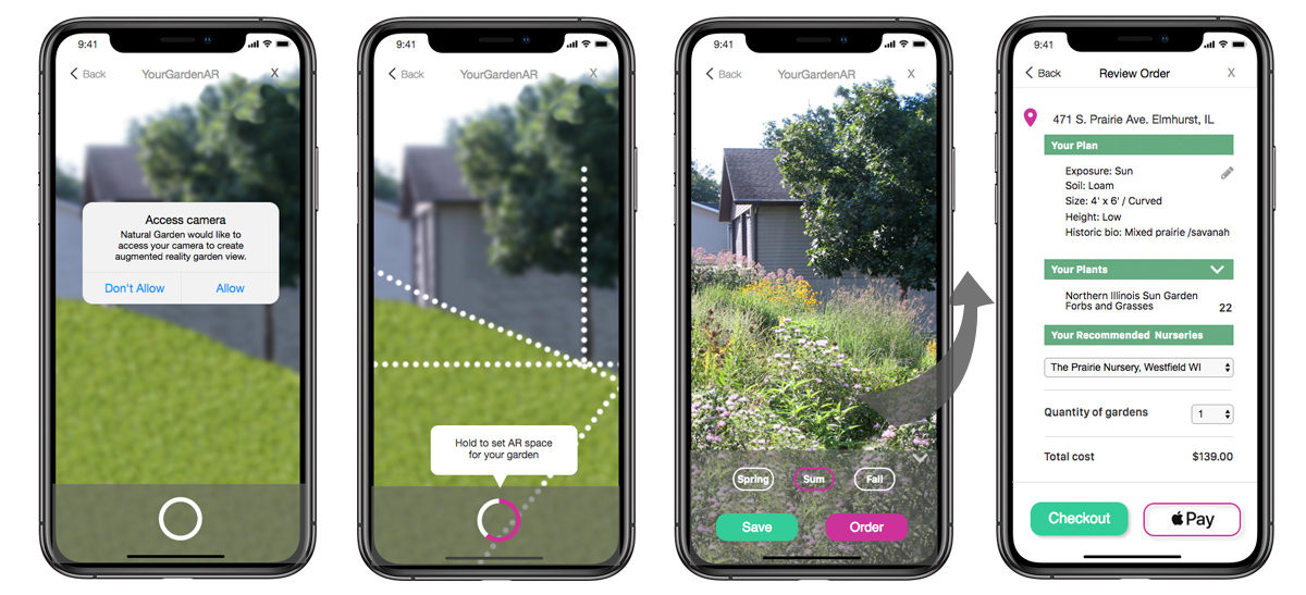
A mobile app for a native plant garden needed to consider the benefits of the camera, location mapping, and augmented reality to help users envision a future garden. Additionally there must be a simple way to customize the garden and purchase.
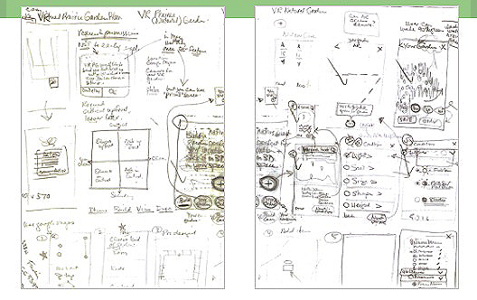
Sketching the UI interactions and flow.
Wireframes refined ideas.
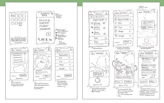
Mid-fi interactive prototype for Easy Native Plants
A mid-fidelity prototype was created in Axure. Notable is the augmented reality interaction accessible through the camera. Permission is given at the time of use rather than on loading of the app. This increases engagement and lessens the likelihood that the user will deny the permission. It also gives a clearer rationale to the user as to why the camera is needed.
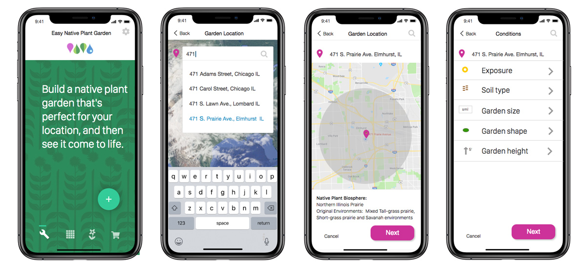
See the Axure interactive prototype here.
Easy Native Plants prototype walk-through
Native Plants Project highlights and retrospective
- Excellent use of unique phone strengths in location, camera and augmented reality.
- Good business concept with tie-in to local native plant nurseries who are often looking for new customers.
- Competition in this area is very low giving entry a good amount of time to establish preference and dependence on the app.
- Additional research could be done using remote surveys and online services such as SurveyMonkey, HotJar and Qualaroo to gain more knowledge of our user and feedback on interactions.
Physicians Alignment Quality (PAQ) desktop and mobile app
Company
Symbria PAQ desktop and mobile app
Team
Rich DeJong: CTO
Hien Do: Software Development Manager
Brian Cerney: Lead Senior Software Engineer
Aaron Hagopian: Director Data Analytics
Yvonne Nillissen: Senior UX Designer
My Roles
Sketching- user flows and UI, Static low to hi-fi prototypes.
The Health Resources Alliance (HRA) publishes a Standards of Practice for skilled practitioners (including physicians) in skilled-nursing care. The goal is to establish a high standard of care for all patients. The challenge for Symbria was to develop software that could improve the time it took for physicians to make mandatory visits to patients at skilled-nursing facilities. This was called Physicians Alignment Quality, or PAQ.
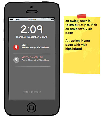
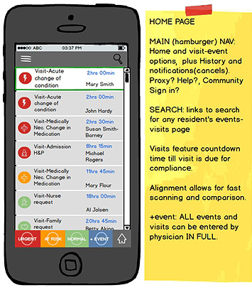
PAQ looked at critical events in the care of the patient at senior-care facilities. These events included transfers from other facilities such as hospital or home, weekly physician visits, and visits necessary after a medication change or a change in the patient's condition.
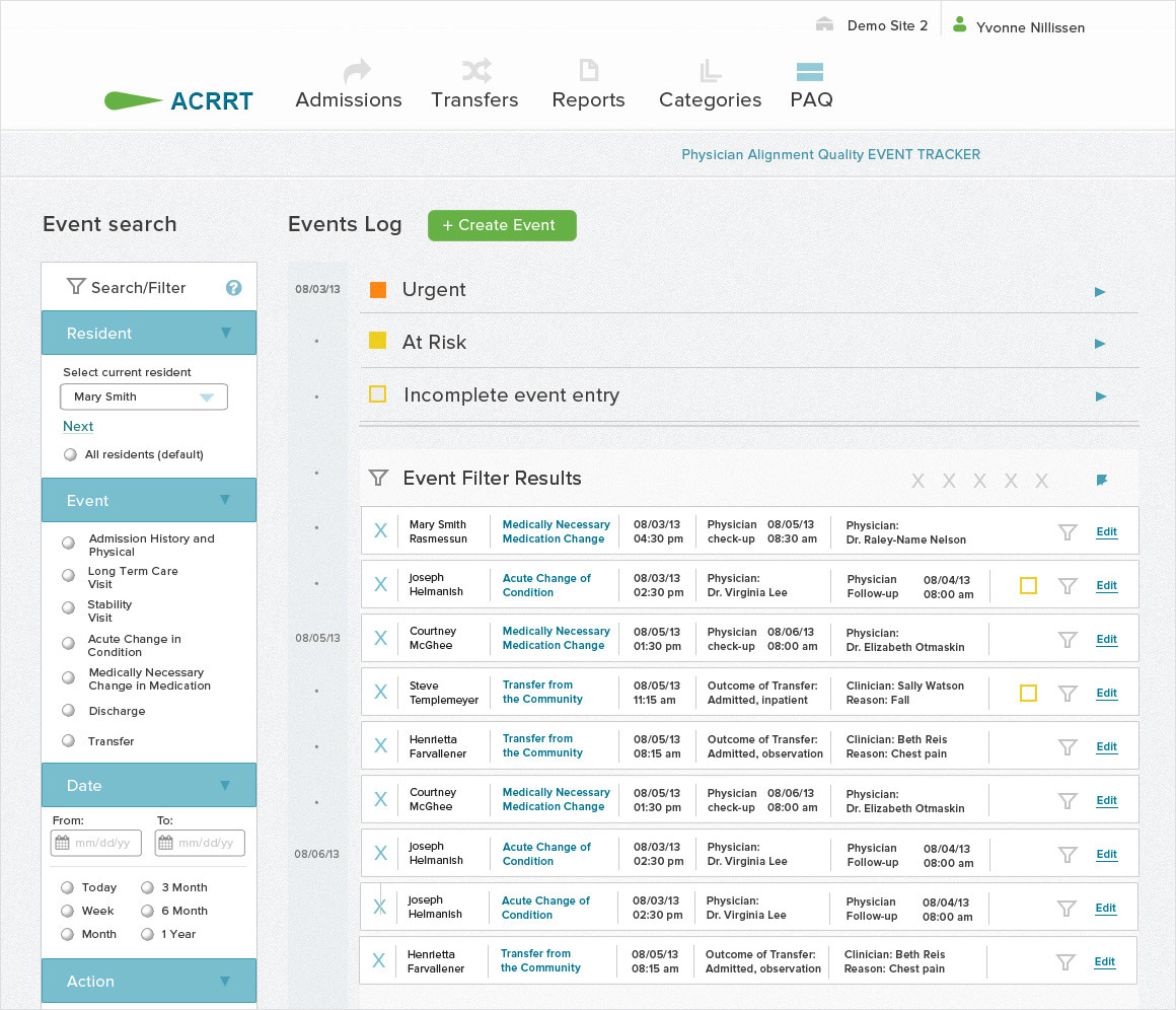
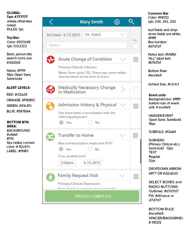
The PAQ high-fidelity desktop application.
PAQ research
Symbria partners with senior-care facilities for many needs including rehab, pharmacy and analytics. Symbria wanted to develop the software to sync with existing patient and staff management software. The application would have a desktop channel for facility staff and a mobile channel for physicians to use while making their rounds. These would support and complement each other with high administrative functionality prioritized for the desktop, and high physicians' task efficiency for the mobile.
A questionnaire was sent to physicians asking what information they needed while making their rounds and required visits. With this data, and direction from senior stakeholders, the team began to move forward with concepts for the software.
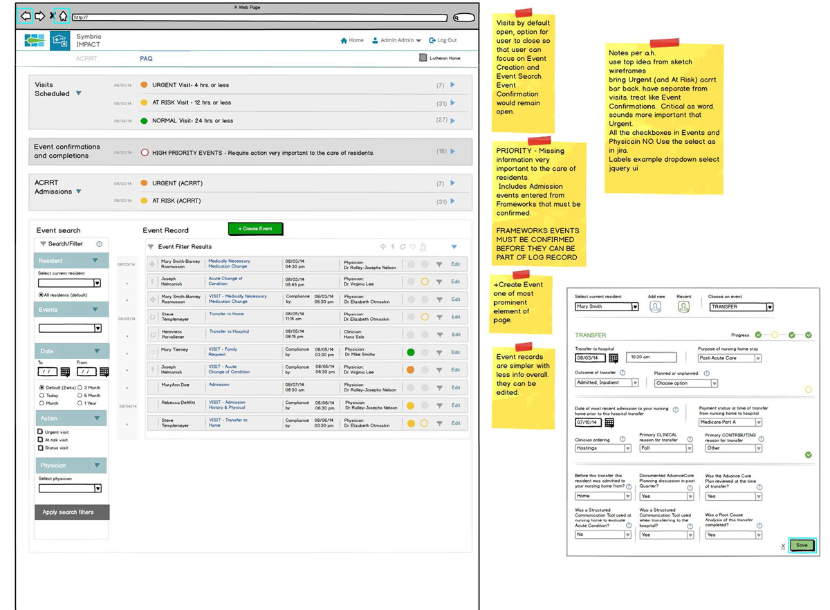
PAQ desktop
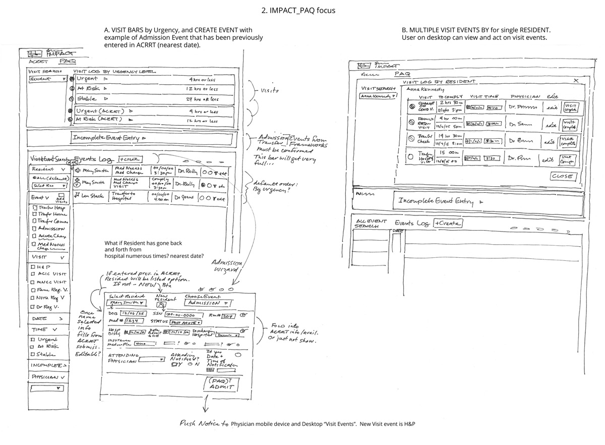
Clients used existing Symbria software at their facilities. The Physicians Alignment Quality (PAQ) software would function from within this the existing software. Desktop and mobile functionality were considered concurrently and sketches and prototypes were created. Following are sketches and mid-fi prototypes for the desktop channel.
PAQ desktop sketches and mid-fi prototype
PAQ Mobile
Sketches
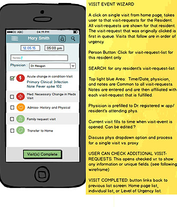
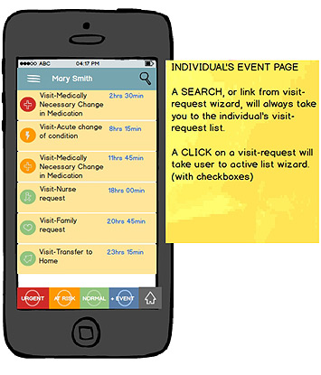
The mobile channel considered the needs of the physicians while making rounds at facilities. How would visit alerts be prioritized? What functions from the desktop were unnecessary for mobile? How would the app function when multiple visits were required for one patient? The mobile sketches began to address these questions and prioritize answers.
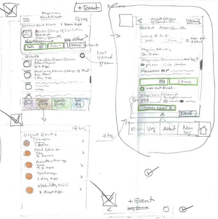
Exploration of the mobile app flow and UI
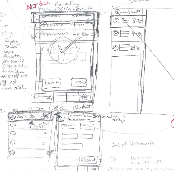
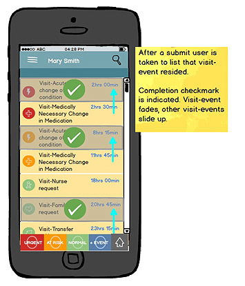
Removing completed patient visits.
PAQ mobile mid-fi prototype
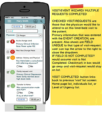
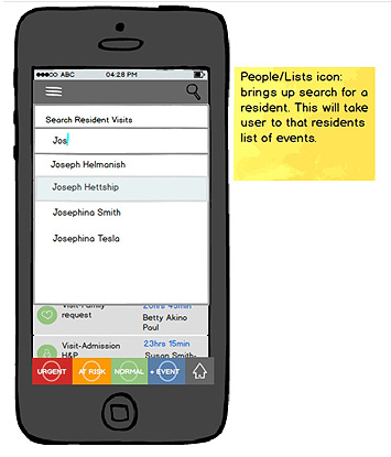
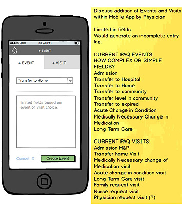
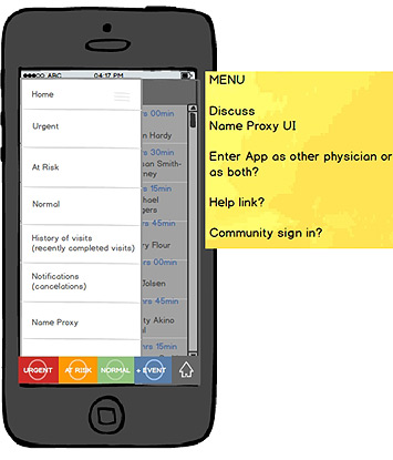
Following are the detailed interactions outlined for PAQ mobile. They include navigation, search, addition and cancelation of events, and sign-in.
PAQ Graphic elements
Icons were created for desktop and mobile events and a template that worked within existing Symbria software style guidelines.
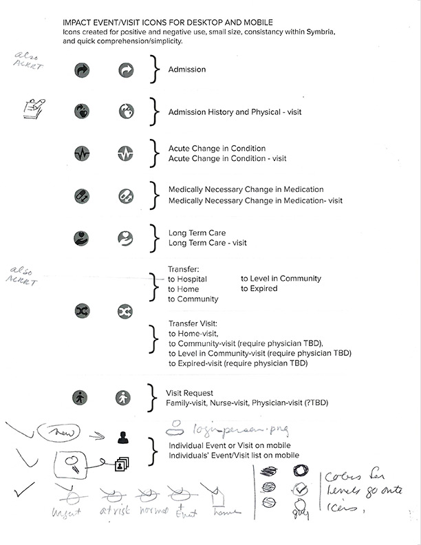
Icon development for desktop and mobile versions.
Template outlines colors and text parameters for use within existing Symbria style guidelines.
PAQ development highlights and retrospective
- Integration of a PAQ module into existing enterprise software.
- Challenging mobile context where users had little time and a high level of responsibility for outcomes.
- Design of a multi-channel high-productivity platform.
- Additional research on both desktop and mobile users would have been desirable.

Community alerts application
Product
Blockwatch community safety app
Team DePaul HCI
Yvonne Nillissen
Tonya Ojuluwayo
Joe Torres
My Roles
Research – Personas and Card Sort
Sitemap, Wireframes, low to high fidelity prototyping
People living in Chicago enjoy access to cultural attractions, entertainment, fine restaurants, and public services, however living in any densely populated area presents security and safety concerns. An engaged community that is actively involved in the well-being of its neighbors can be a powerful tool to reduce and deter crime as evidenced by the success of neighborhood watch programs. There is currently no holistic resource for Chicagoans to inform, map, report, and hopefully, deter crime in their neighborhoods.
BlockWatch is designed to be a real-time database of neighborhood user-generated crime data that drives community engagement. The mobile/desktop app is designed to allow citizens to be active participants in the safety of their neighborhoods and communities.
blockwatch research
Design Bias
Overview
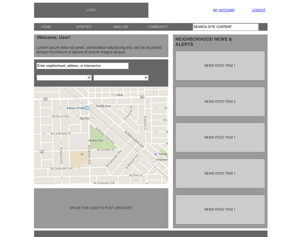
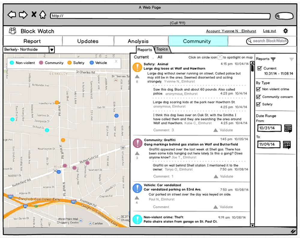
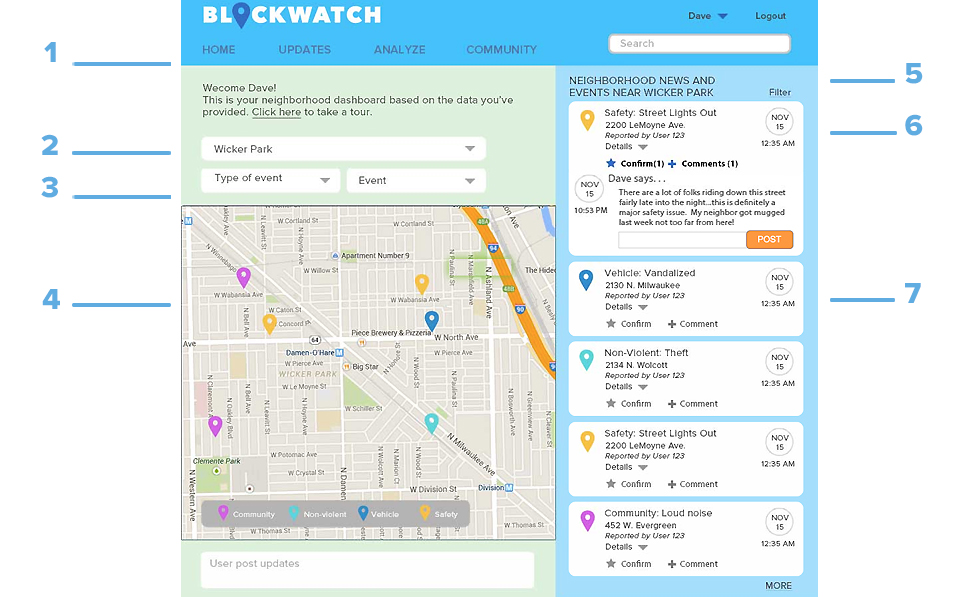
In both mobile and desktop applications, the user lands within a contextually relevant neighborhood dashboard when logged in. The desktop interface was designed to allow the user a more complete experience while the mobile app was designed to allow the user easy access to event reporting.
Desktop
The desktop interface was designed for the user that reports infrequently, and users of this interface have easy access to reports and analysis. User knows that map view shows recent reports, and news feed displays posts that are most relevant to them.
Mobile
The mobile app was designed for the immediacy of reporting and posting potential crime/safety concerns. Frequent users know that the camera icon can be used to capture an incident, the “Map Me” function records current location, and date/time auto populates with current date and time.
BlockWatch Personas
Desktop User and Scenario
PATRICK
Patrick is an avid cyclist living in Bucktown. He logs in to BlockWatch on his laptop. He notices a trend of bike thefts in the area. He’s just purchased a new security mechanism for his bike and wants to share it with the community. He comments on another member’s post about broken bike locks with his recommendation.
Mobile User and Scenario
KATE
Kate is walking her dog in the Buena Park neighborhood at 7:00am on a Saturday morning. The night before, a thunderstorm had damaged a tree that was now lying in the street. Kate, a BlockWatch community member, reports the possible hazard using the app.
Card Sort
The goal of this card sort was to explore how ‘crimes committed in a neighborhood’ might be organized. In the card sort we hoped to gather broad ideas about how the website/app might be structured and also illuminate in a more granular way, how people would expect to quickly and easily report the crimes that they observe. The card sort had 10 participants.
Dendrograms analysis
Using the Best Merge Method recommended for card sorts with fewer participants, the following broad groups emerged:
- 80% grouped Clerical, Traffic hazards/Public safety issues, Vandalism, Community upkeep, Reporting, and Neighborhood issues together.
- 70% grouped Violent crime, Immediate concerns, Red flag issues together.
- 44% grouped Drug crimes together.
Many other issues were assembled across broad results. See chart below.
Similarity matrix
The similarity matrix revealed three main categories where issues were grouped. Descriptions of groupings are used here.
- Local outdoor/ Traffic/ Automobile vandalism
- Assault/Robbery/Theft/Home invasion
- Drug/Loitering/Drunk or Reckless driver
See chart below.
Overall analysis of formed groups
In general participants formed groups around perceived threat or seriousness of a crime. This is a result that could be expected.
What was unexpected in the results was the degree of variation in the labels and categories. While results did separate into very broad categories, there were many description groups.
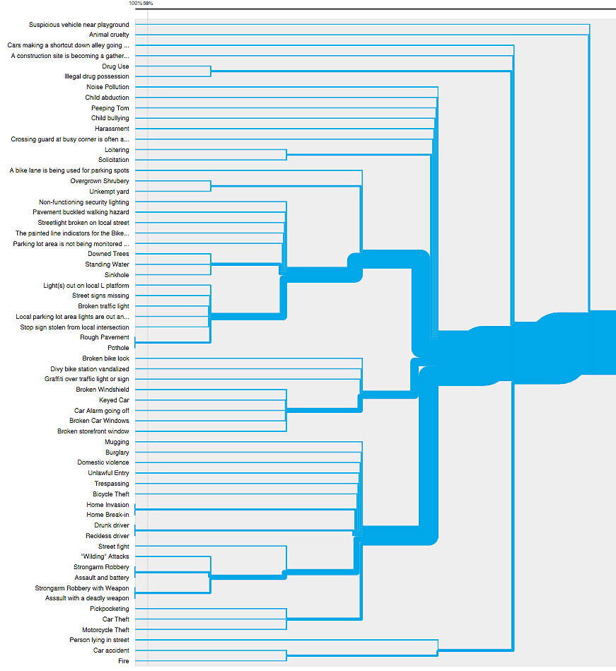
Dendrogram shows the hierarchical relationship between objects. Its main use was to work out the best way to allocate objects to clusters.
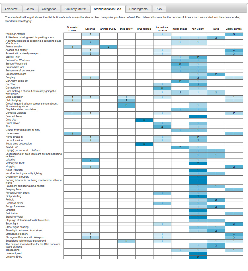
The Similarity matrix shows distribution of cards across standard categories that the team had defined. Each table cell shows the number of times a card was sorted into the corresponding standardized category.
blockwatch ideate
Wireframes and lo-fi prototype
An exploration of newsfeed.
An exploration of reports.
Prototype Blockwatch Desktop
- Simple high level navigations features analysis.
- Upon logging in the desktop app, the registered user is taken to a dashboard view defaulting to his or her home neighborhood, and the news feed listing user-reported safety/crime issues sorted by relevancy to the user (based on specified preferences and weighting of reported issues).
- User can enter an event on desktop and mobile.
- Map features color value of events corresponding to events feed.
- Newsfeed with filter. All of one type or other criteria
- User can comment, confirm and add to a post.
- Posts include original and update time/date. Event can be posted anonymously or by user name.
Blockwatch mobile
The mobile mid-fi prototype
Make a report
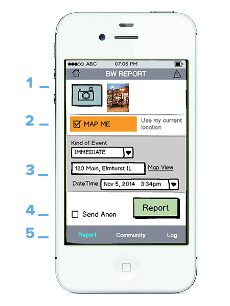
Reporting an event
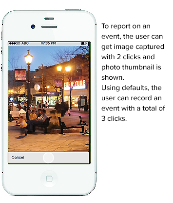
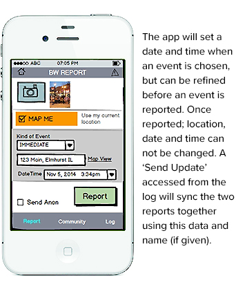
- Mobile app reporting is maximized for quickness. The user may not wish to spend more time at the scene of an event than is absolutely necessary. Thus user can take picture with 2 clicks and photo thumbnail is shown.
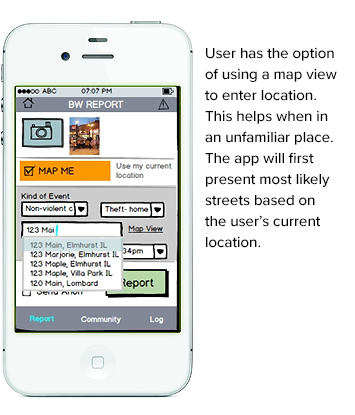
- The Map Me option is selected by default so that the location is recorded when the report button is pressed.
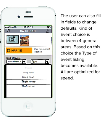
- Kind of Event defaults to IMMEDIATE. This can be changed by user.
- Date/Time are also set to current as the default. Also changeable.
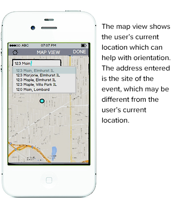
- User can access map view for orientation or to set event at a different location.
- Send Anonymously is option. This can be set to 'always select' in preferences.
- Bias is for frequent user: User will know that Camera area will indicate thumbnails of photos taken; Map Me mobile function is auto using current location; and Date:Time are current.
- The user can record an entire event, with photo, in 3 clicks.
- Frequent user also knows that they can update a report by finding in the log area. This sends a report to the local police dept that will be synced with the original.
More on reporting
The event log
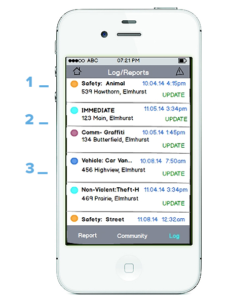
- The user may not wish to spend more time at the scene of an event than is absolutely necessary and so update event later.
- User can access a log of all of their own reports.
- Log list features color coded events for easy identification.
Update event
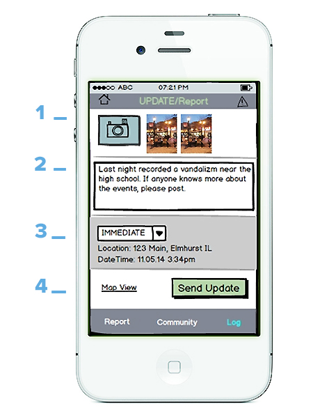
- In updating an event, user can take additional photos if desired.
- User can add comments
- Type of Event is available to update, as is specific event (which shows once general type is selected). Location and DateTime of initial report can not be changed.
- 'Send update' syncs the two events together using this data (and that of the app user name).
Blockwatch mobile reporting continued
Following are the detailed interactions for BlockWatch mobile. They include photo, event type, map view, and setting time/date.
BlockWatch highlights
- Exploration of desktop and mobile application biases.
- Design of social community.
- Complex mobile application fully using phone features to advantage with camera and location.
- Good use of card sort data to learn event and crime-type user expectation.