Journey through senior healthcare
Journey Map
Explore healthcare pain points
Team
Janet Viane: CTO
Kendra Grant: Director of Business Development
Jackie Malek: Marketing Director
Yvonne Nillissen: Senior UX Designer
My Roles
Research, ideation, design, presentation.
Symbria is a company that serves the needs of healthcare facilities for seniors, providing rehab, pharmacy and business services. Symbria products and services offer increased savings and safety, leading to better care for individuals.
Symbria leadership wanted an overview of its place in the larger healthcare business ecosystem. The goal was in one sense to see a bigger picture, and in another to drill down to the experience of a single patient within that space. Ultimately, Symbria hoped to discover areas where it could develop new services to support the senior-care patient during the journey.
Key Features of Journey Map
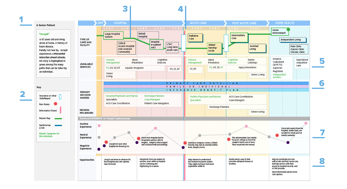
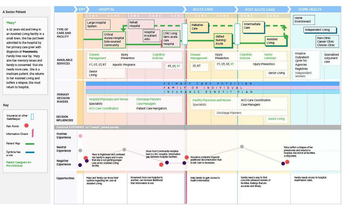
- Create a persona who has a medical event and who moves between different stages of care and Symbria touchpoints.
- A key to the journey map explains visuals for insurance gatekeepers, patient pain points, and information chasms.
- Each journey can be different depending on type of care, available services and decision makers.
- The information chasm (in red) was of particular interest to Symbria. There was often a confluence of pain point, insurance gatekeeper, and transfer between types of healthcare facility at the chasm.
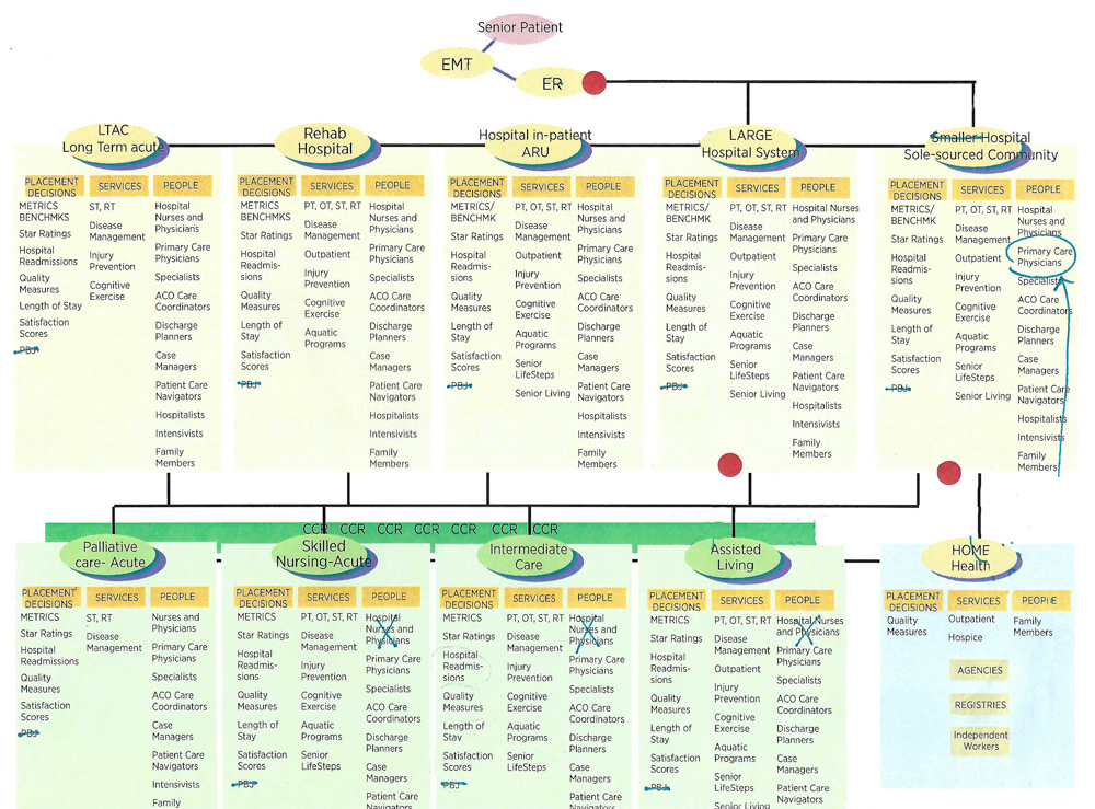
- Symbria has many services at all stages of the journey and at different healthcare facilities.
- The team focused on the primary decision makers that had influence at virtually all stages of the journey.
- Pain points were an important focus of the visualization exercise and ranged from positive to negative.
- The opportunities section of the journey map was where Symbria began to envision new products and services.
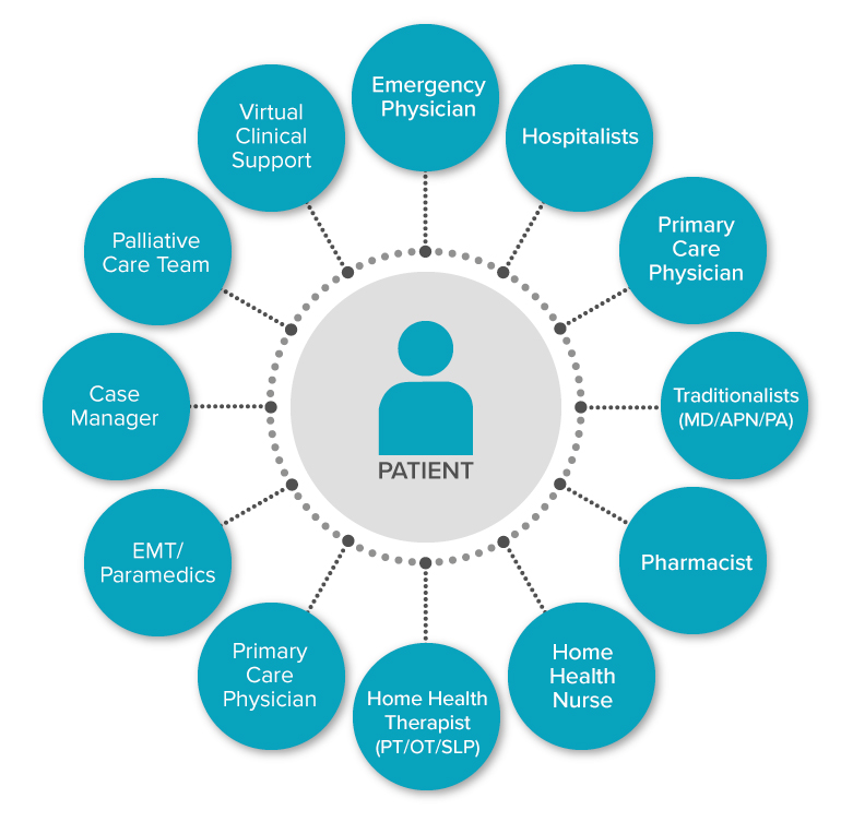
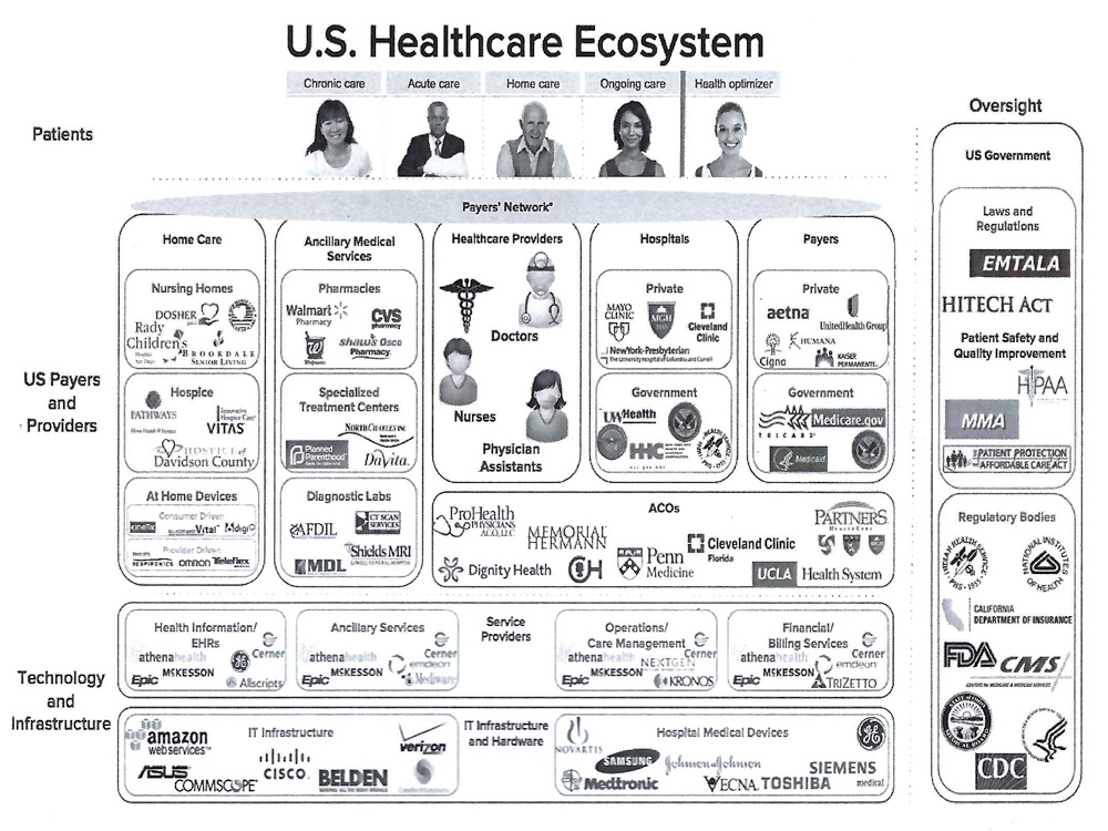
Research into healthcare landscape
The UX role included gathering background resources from the team and determining value for the journey map. Following are key graphics that played a part in visualizing a senior patient's journey. Additionally, the sales team offered insight on venues into which a senior would be placed when discharged from the hospital, lists of Rehab services and where they would be used, and drivers of decisions for placement like Star Ratings and Satisfaction Scores.
Of course the team was mindful of the U.S. Healthcare system overall, where our senior patients were one of many kinds of patients, care, insurance carriers, technology and government oversight.
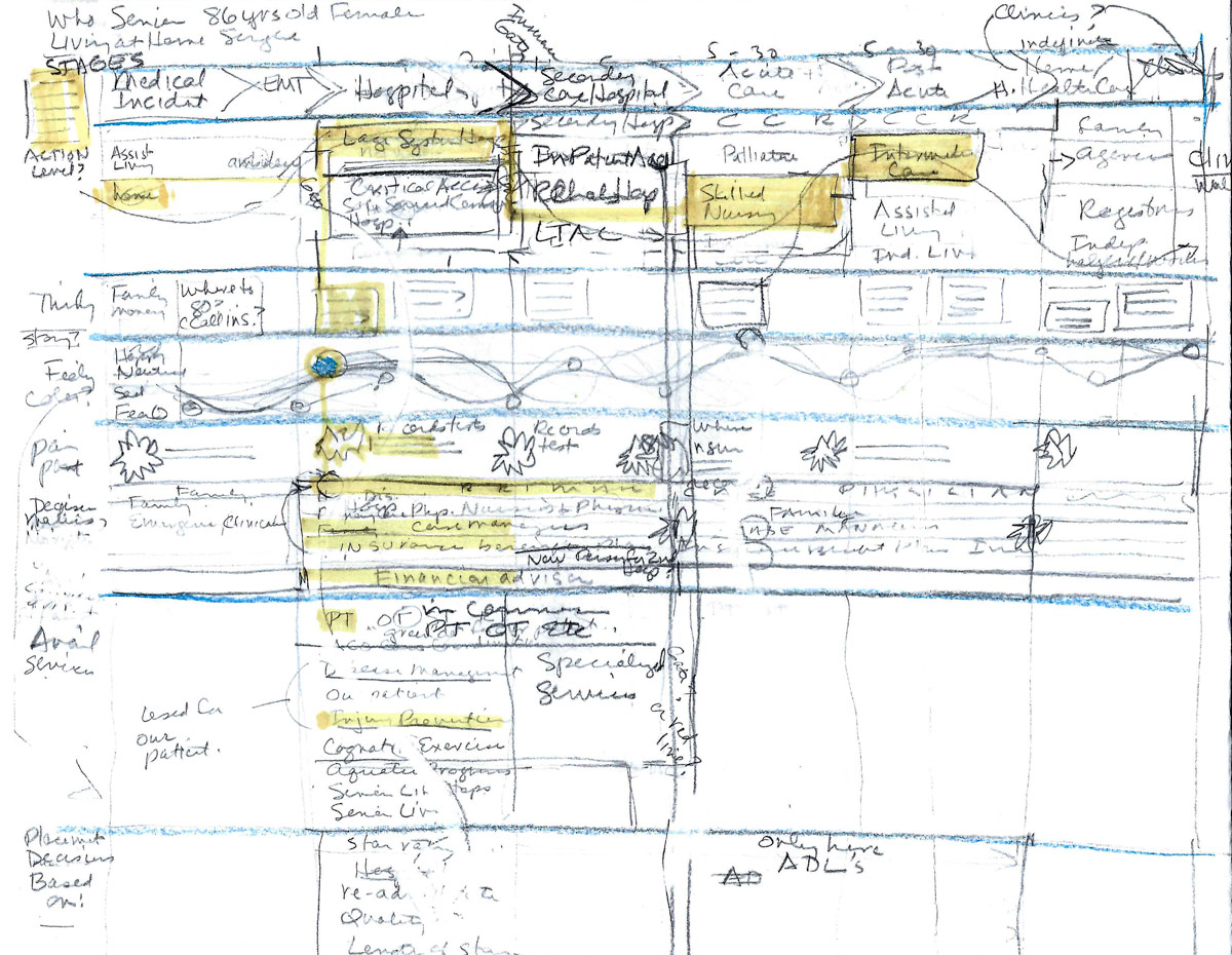
Sketching the journey
Iteration 1
Ideation and sketching began with Symbria services, placement decisions and people at each stage of a medical event journey. Visualization of pain points and the sense of a timeline were not maximized.
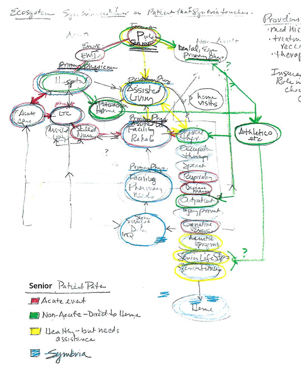
First sketch of the patient journey through the healthcare business ecosystem
A mid-fidelity graphic charts the journey and pain points
Iteration 2
The ideation and sketching for second iteration of the map began to create channels where different section of information could live on a progressive timeline. This original structure would make comparisons and insights available at a glance. It could also be easily adapted for new personas.
Presentation of the journey map
The journey map was a resource for Symbria leadership during consideration of new products and services. The result was a focus on new business analytics offerings for senior-care facilities nationally.
Journey Map retrospective
- Excellent visualization tool for big-picture stakeholder decision making.
- Resulting business analytics service offerings are a growth area for the company. Analytics focus on Home Health and Hospital (including readmissions) Insights, Physician Outcomes, Physician Referral patterns, and general quality outcome measures.
- Journey map could benefit from further research. This could take the form of in-person qualitative interviews, remote surveys, and expert reviews of the map and contributing data. These research techniques should focus on both seniors' experience and those of primary decision makers. This would give stakeholders greater confidence in the resulting map.
Bring Volunteers and Recruiters together
Company
Volunteering websites and apps
Team DePaul HCI
Kelly Freehan
Becky Morrissey
Yvonne Nillissen
Jesse Stellwagon
My Roles
Inquiry Research, Workshops, Presentations, Report
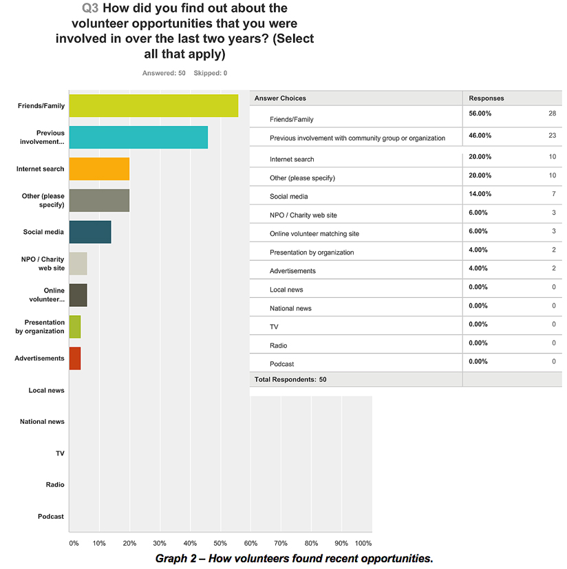
Our literature research showed that the U.S. volunteer rate is on the decline.
This preliminary research also showed that people who volunteer are just as likely to volunteer after finding opportunities online as they are after being personally recruited.
In this project, we explored the different ways that volunteers and the charities and Not-for-Profit Organizations (NPOs) that need them find each other and we aimed to determine if there was a way to improve the efficacy of online volunteer search sites.
Research Goals for the inquiry
We conducted research aimed at making volunteer processes easier for all involved. Specifically, we asked how can we help volunteers, potential volunteers, and non-profit organizations maximize the experience of volunteer involvement. The team outlined 3 goals to achieve our objective and used different research methods to complete them.
Research Goals and Methods
- Goal 1: Define how volunteers search for opportunities online
RESEARCH METHOD: Conduct observational inquiry with volunteers to find actions, sequences and intentions. - Goal 2. Define how volunteer recruiters find, keep and engage volunteers
RESEARCH METHOD: In-depth interviews with recruiters to understand context and what strategies work better than others. - Goal 3. Define how volunteers find, establish and maintain satisfying volunteer relationships
RESEARCH METHOD: Survey of broad range of volunteers to find their motivations, how they find opportunities and how these align with skills.
Goal 1: Observations of volunteers
RESEARCH METHOD: Observational Inquiry
The observations were conducted using contextual inquiry methods as we took field notes. Contextual inquiry helped the team focus on the sequence of actions the participants made online, the intentions, the triggers, and where we could see loops and breakdowns.

Participants
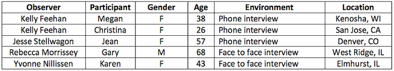
We recruited participants through personal connections. All participants were screened to ensure their interest in volunteering. Each participant signed a consent form. Four participants were female, one was male; ages ranged between 22-65. All participants used either their personal or work desktop computer.
Data collection
Participants were asked to read and sign the consent form. All observations were done in person following a common script. Field notes were taken. Observations were recorded by moderators using their mobile phone or Zoom video conferencing. Interview questions explored:
1. Participant's activities online
2. Sequence of activities
3. Sites visited
Data analysis
After completing all observations, the team transferred notes to digital sticky notes using the online affinity diagram tool Stormboard. We met via videoconference and grouped our individual notes together based on common themes (figure 1). A flow diagram was created to show sequences taken by participants (figure 2).
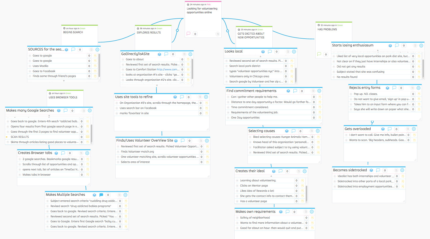
Figure 1. Affinity board showing themes found from observations of volunteers.
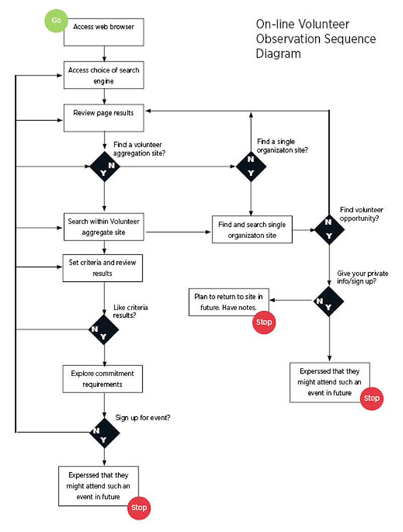
Figure 2. Flow diagram showing sequences taken during observations.
Observation findings
- Location
Participants all included their location (city or zip code) as search terms. - General Search
Looking for volunteer opportunities in general - Specific Search
Looking for a specific type of volunteer opportunity (ex: volunteering with children, pets, etc). In this case, one user in particular struggled to find what she was looking for. - Word-of-mouth
All but one participant mentioned to observer that they’d found past volunteer opportunities through word-of-mouth. - Variety and difference
Participants found a large variety of volunteer sites and each site appeared to have different opportunities.
Goal 2: Interview volunteer-recruiters
RESEARCH METHOD: Interviews
The interviews were conducted using in public places and homes as we recorded the interviews and took notes. The team conducted five interviews with volunteer-recruiters. During the interviews, we asked volunteer-recruiters how they find, keep and engage volunteers. We were interested in problems and successes they had in the past. The interviews gave us additional insight into the volunteer process as a whole.

Participants
We recruited participants through personal connections and Facebook posts. All participants were screened (see appendix) to ensure that they were experienced volunteer managers that had recruited volunteers. Each participant signed a consent form (see appendix). Four participants were female, one was male; ages ranged between 26-68.
Data collection
Prior to conducting our interviews, our research team collaborated to write a common interview protocol. Each member of the team followed the protocol when conducting interviews.
After signing a consent form, each member of the research team spoke to an individual that had experience in recruiting volunteers. We audio recorded the interviews; interviews ranged from 20-45 minutes.
The interviews were structured so that we started by understanding a bit about context. We asked our interview subjects about their personal histories, careers and motivations for volunteering. We also discussed the organizations. We asked about size, mission, personal connection and how volunteers helped them to achieve their goals. After we understood the context, we discussed how they went about recruiting volunteers. We asked about methods that work and methods that don’t and tried to get their opinions on why different strategies may work better than others.
After the interviews were complete, each team member transcribed her/his interviews, and then shared them with the team. We then performed open coding on all of the transcribed interviews.
Data analysis
After completing coding of interviews, we transferred our notes to digital sticky notes using the online affinity diagram tool Stormboard. We workshopped via videoconference and grouped our individual notes together based on common themes (figure 4).
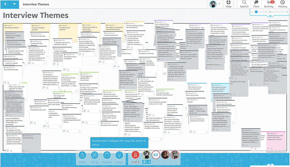
Figure 4. We captured our codes workshopping in Stormboard to reveal themes.
Interview findings
- The goal of recruiting volunteers is to establish a relationship
This can be found within the first stage of effort of recruiting. - Recruiters rely heavily on their interpersonal skills to draft volunteer candidates
Recruiters will promote their organization at any moment to recruit volunteers. - Recruiters are passionate about their jobs
Recruiters see themselves as evangelists for their cause. - Recruiters work to fit volunteers to specific jobs
Recruiters want to know their volunteers’ strengths and backgrounds to best fit them on an effort. - Online matching tools are not the preferred method of recruiting volunteers
Recruiters rely on face-to-face vetting when recruiting volunteers and this is not possible through a web site. - Recruiters recognize the need to keep their volunteers happy
Recruiters hope that a positive volunteer experience will keep a volunteer coming back.
Goal 3: Survey of many volunteers
RESEARCH METHOD: Online survey
To further understand our observation and interview findings, we conducted a survey that centered around three questions:
1. Do in-person recruiting methods result in more volunteer engagements than online recruiting methods?
2. Are volunteers that were recruited personally more satisfied with their experiences than volunteers that found opportunities online?
3. Are volunteers that perform tasks related to their skillsets more satisfied than those that don’t?
Participants
Our survey participants were friends, family and peers. We recruited participants personally, through email, social media posts on Facebook, and the DePaul University CDM/COMM participant pool.
Fifty participants took the survey. All participants were included in the final data analysis. Our participants ranged in age from 18 to 74 years, with majority of our participants (54%) falling in the 18-34 age range. Half of our participants had used online resources.
Data collection
We used SurveyMonkey for our survey platform. The survey was accessible through the CDM/COMM participant pool as well as an independent link that was circulated by email, social media and groups to which the researchers belong.
Prior to conducting our surveys, our research team collaborated to write a common survey template that consisted of 35 questions.
Our survey was open for 5 days. We closed the survey and collected summary data provided by SurveyMonkey into Excel sheets that were used as input to SPSS for Chi-square and Mann-Whitney U analyses. Additionally, we exported the survey data into a Word document and coded the responses to inform our qualitative data analysis.
Data analysis
After closing the survey, the team split into two groups. One half of the team performed qualitative analysis on the open-response survey data. The other half of the team performed quantitative analysis of the data focused around three areas.
1. Engagement.
Volunteers who found their opportunity by being recruited in person were more likely to volunteer than those who found their opportunity online.
2. Satisfaction.
The satisfaction level of volunteers who find their opportunities online will be lower than those who find them in other (traditional) ways.
3. Skillsets and Satisfaction.
The satisfaction level of volunteers whose personal skillsets are used will be higher than volunteers whose skillsets are not used.
Volunteer Survey findings
Inferential statistical results – Engagement
Question 1 – Do in-person recruiting methods result in more volunteer engagements than online recruiting methods?
To test, we formulated a Null and Alt (Directional) hypothesis and used a Chi-square analysis to test its significance.
Directional Hypothesis – Volunteers who found their opportunity by being recruited in person were more likely to volunteer than those who found their opportunity online.
Null Hypothesis – Whether or not a person accepts a volunteer position does not depend on whether they heard about the position online or were recruited for it in person.
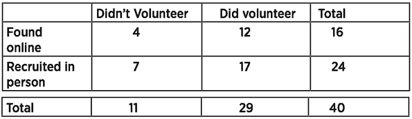
Conclusion – We explored if "How a Volunteer Opportunity was Found" was associated with "Volunteer Follow Through"- if the volunteer did complete the volunteering opportunity. We found that the association was not significant. [X2 ( 1, N= 40) = .084, p = .77]. Volunteers recruited online were not more or less likely to follow through on a found opportunity than those volunteers who were directly recruited.
Inferential statistical results – Satisfaction
Question 2 – Are volunteers that were recruited personally more satisfied with their experiences than volunteers that found opportunities online?
To test, we formulated a Null and Alt (Directional) hypothesis and used a Mann-Whitney U test for significance.
Directional hypothesis – The satisfaction level of volunteers who find their opportunities online will be lower than those who find them in other (traditional) ways.
Null hypothesis – There is no difference in satisfaction levels between volunteers who find their opportunities online and those who find their opportunities in other (traditional) ways.
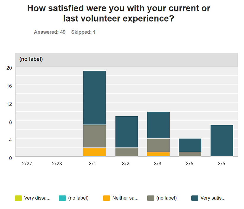
Conclusion – We conducted a Mann-Whitney U test to compare the level of satisfaction with the Volunteering Experience between participants who found volunteer opportunities online and those who did not find their opportunities online (found in traditional ways). There was no significant difference of the medians between the satisfaction ratings at alpha level .05 [U(42)=156.5, Z=-1.7, p=.081]. The mean rankings of Online and Other were 18.4 and 24.6, respectively.
Inferential statistical results – Skillsets and Satisfaction
Question 3 – Are volunteers that perform tasks related to their skillsets more satisfied than those that don’t?
The volunteer recruiters we interviewed stressed the importance of fitting a volunteer to the assignment. This seemed to be a more difficult stage in establishing a volunteer recruitment effort than finding potential volunteers. They felt that the success of the effort depended on having the right people in the right positions, and volunteers that worked on assignments aligned to their skillset were more successful at the tasks and more likely to maintain a relationship with the organization. To test this, we identified volunteers that were given assignments commensurate with their skillsets and measured their satisfaction levels.
We formulated a Null and Alt (Directional) hypothesis and used a Mann-Whitney U test for significance.
Directional hypothesis – The satisfaction level of volunteers whose personal skillsets are used will be higher than volunteers whose skillsets are not used.
Null hypothesis – There is no difference in satisfaction levels between volunteers who used their personal skillsets and those who did not use their skillsets.
Conclusion – We conducted a Mann-Whitney U test to compare the level of satisfaction with the volunteering experience between participants who used their personal skillsets and those who did not use their skillsets. There was significant difference of the medians between the satisfaction ratings at alpha level .05 [U(32)=63.5, Z=-2.5, p=.012, r=-.43]. The mean rankings of Used Skill and Didn't Use Skills were 19.85 and 11.85, respectively.
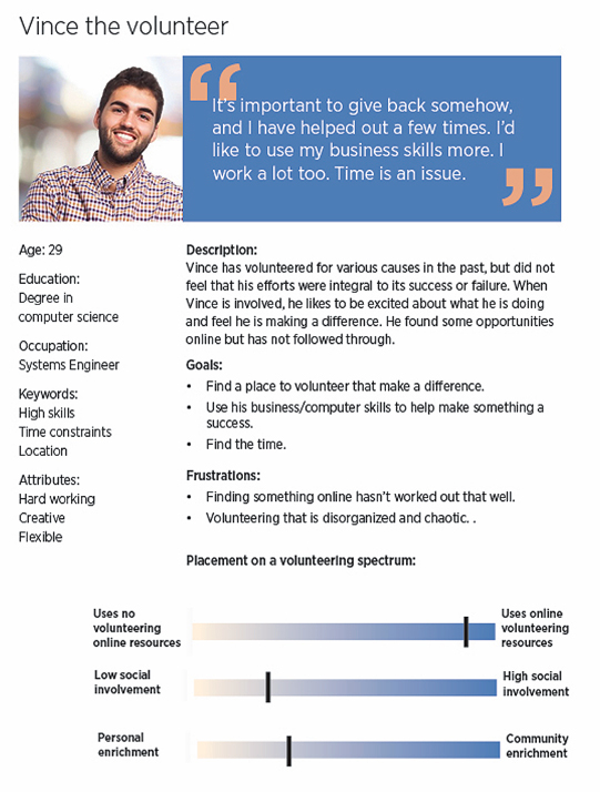
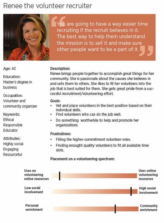
Personas
Volunteer and Volunteer-Recruiter
Based on our observations, interview and survey findings, we created personas to represent volunteers and volunteer recruiters. These also included Usage Scenarios
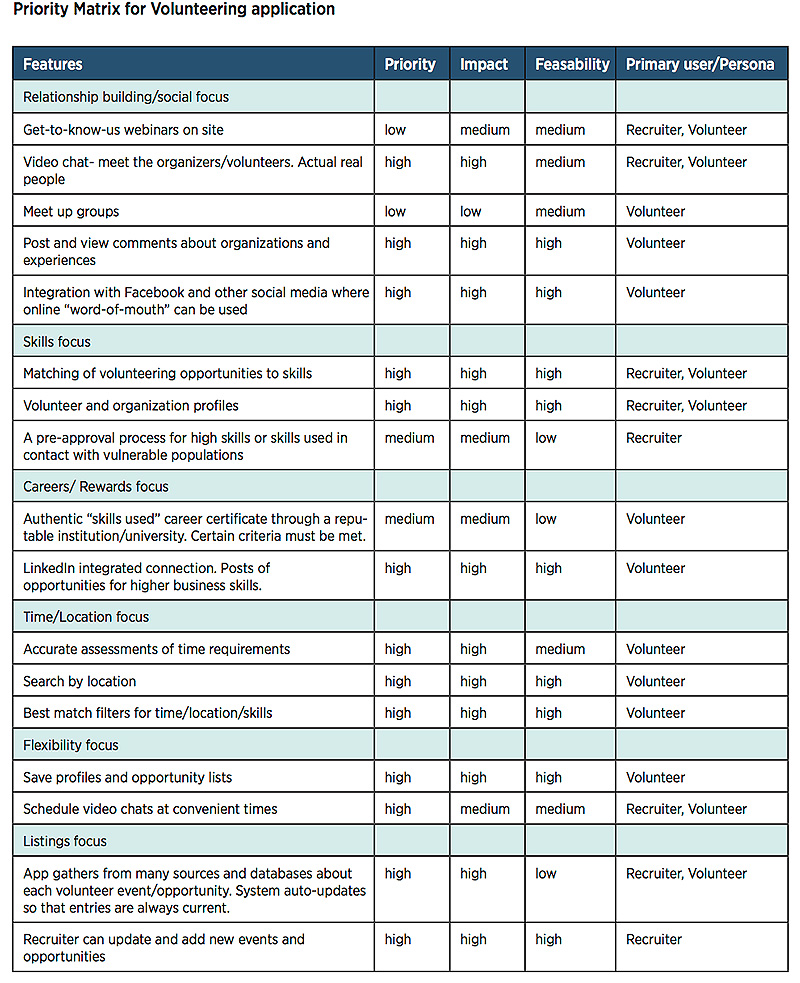
Design Priority Matrix
Based on our observations, interview and survey findings, we created a matrix of potential priority features for a future volunteering application.
Overall Design Recommendations
Based on our research findings, we suggest that any process designed to help connect volunteers and organizations should consider the following:
- The need to establish a personal connection between the volunteer and representatives from the organization. The need to facilitate interaction exists through the life of a volunteer relationship, from recruitment to assignment to action to reward and continued commitments. Volunteering is a relationship and both parties need to know and understand each other in order to best benefit the organization.
- Emphasis on “opportunity convenience” (availability and location). Volunteers tend to have altruistic intentions but the time they can commit may be limited. It must be easy for volunteers to share their availability and for volunteer organizers to respect their volunteers’ time commitments. It is also important for volunteers to understand up front where their services are needed so that they can judge how location factors into the time they have to donate.
- Understanding of skillsets available and required. Recruiters and organizers should communicate the skillsets that are needed and volunteers should easily be able to share their interests and skills throughout the relationship. Once the skillsets are established, organizers should attempt to align assignments and responsibilities to them.
end of case study

Challenge
Company
AsthmaMD mobile app
Team DePaul HCI
Nick Alonso-Emanuel
Sonali Bhurke
Yangye Cao
Dean Christopher
Yvonne Nillissen
My Roles
Heuristic review, cognitive walkthrough, usability test scripts, usability testing and moderating, method and tasks development, findings, analysis of results
AsthmaMD is a free mobile application for users to quickly and easily log their asthma activity, medications, and causes of their asthma in the form of a diary. AsthmaMD logs all of this activity and converts it into reminders, action plans and charts that can be shared with their physicians and included in medical records.
In this study we conducted testing without and with users to evaluate the usability of the AsthmaMD app. The research sought to understand the difficulties users encounter when executing core tasks. The goal was to evaluate the app in its current state and provide recommendations to the developers for making the app easier and more pleasant to use.
Research included a heuristic evaluation, cognitive walkthrough, usability testing and comparison study.
Heuristic evaluation
The AsthmaMD mobile application was evaluated with the Heuristic Evaluation method developed by Jakob Nielsen. Nielsen’s 10 general principles for interaction design are used as broad rules of thumb to approach usability problems within an application. Findings are rated on a severity scale of 0 to 4, where 0 is a problem not recognized by all evaluators, and 4 is a problem that is imperative to fix.
Method
Discovery was conducted by a team of 5 evaluators who were experienced in user testing, but who were not product experts in asthma care. They spent between 2 to 4 hours each, working with all aspects of the application. Following is one sample of the heuristic evaluation summary with descriptions of findings, levels of severity, heuristic principles effected, and suggestions for improvement. Overall, critical usability problems were found in the areas of new user data entry, content display, design consistency, general information availability, and action-plan functionality.
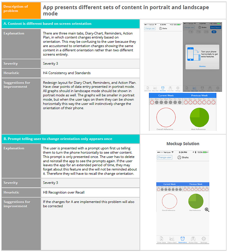
Heuristic evaluation found problems in content changing between portrait and landscape mode.
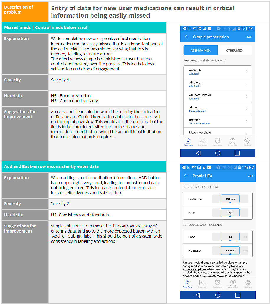
Heuristic evaluation found problems in entry of medication data.
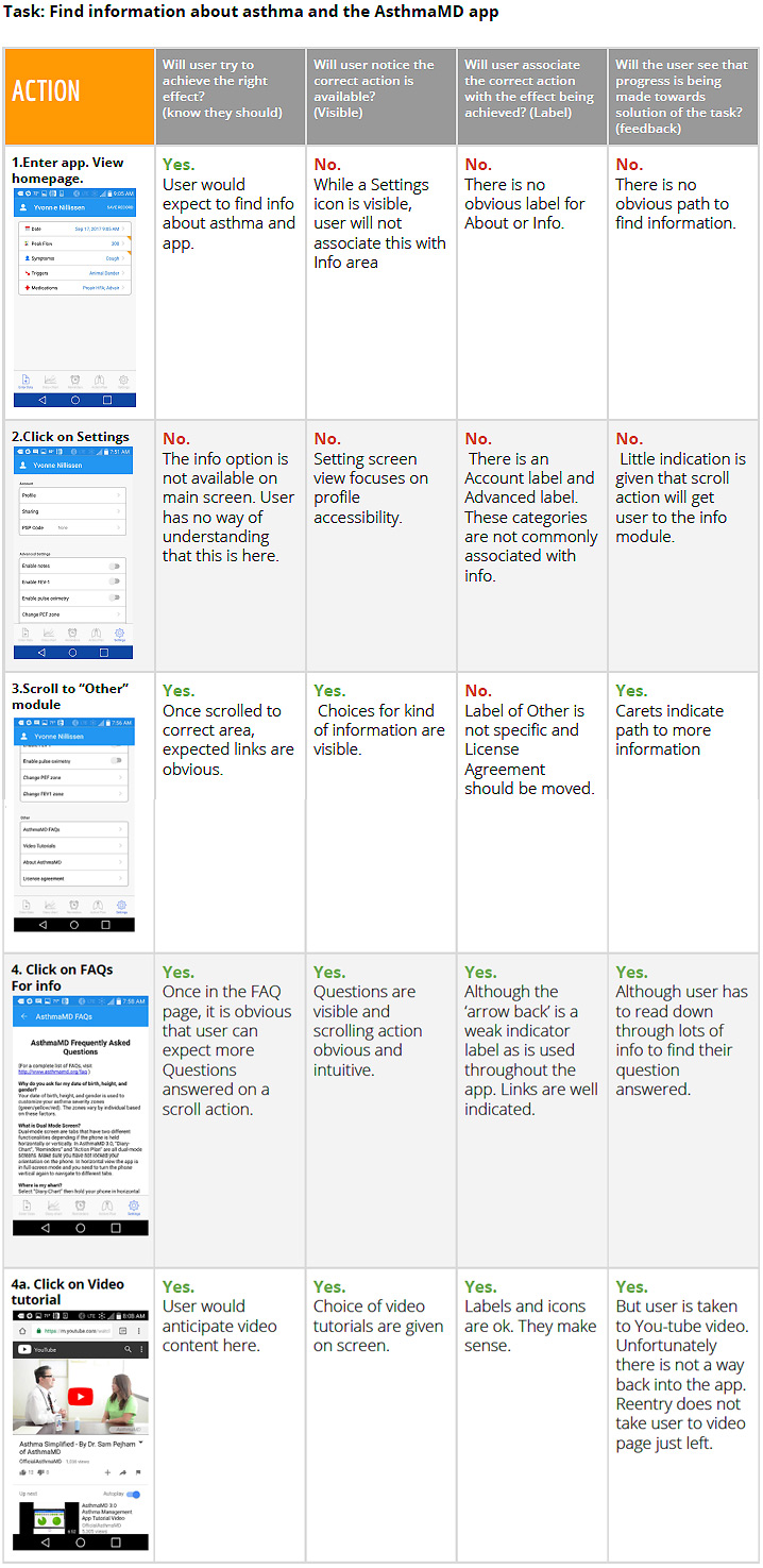
Cognitive Walkthrough
The purpose of the cognitive walkthrough is to examine the application’s usability for target users. Five major tasks were evaluated using this method. The process flow and actions were evaluated to determine if they answered the usability questions and meet usability requirements.
Method
Each evaluator compiled their findings and highlighted design strengths and issues encountered during the walkthrough. As ease of learning is a major goal of a cognitive walkthrough, the task of finding information about how to use the app was one area of focus.
Cognitive walkthrough recommendations
Task: Finding information about how to use the app
Currently the app does not present a guide on how to use the app when the user first creates an account. There is a link to a YouTube video that explains the app, but this is tucked away in a side menu that the user would not know to look into. The user may become confused and frustrated at being unable to complete basic tasks essential to the app and asthma management. They will be more likely to create errors and not be sure if they have completed the tasks.
Recommendation for this task
Implement a tour guide that initializes upon registration with the app. This tour guide would take the user through creating an action plan and entering data. The flow would be made clear to user for both processes. This tour guide would be accessible in the Settings menu after first use. There it could be accessed whenever the user needed a reminder of how to use the app.
usability testing
The AsthmaMD application has been launched by concerned physicians and is being used by many people who suffer from asthma, mild to severe. The product team is concerned that while adoption of the app was swift when released through a network of physicians, usage has been declining and developers suspect the interface may have problems. Based on an initial heuristic evaluation and cognitive walkthrough, they would like to gather objective data and get recommendations for improvement.In this area of our research, the team observed, tested and surveyed participants to evaluate the usability of the AsthmaMD app and to understand the difficulties users encounter when executing core tasks.
We conducted five usability tests to better understand the usage, navigation and flow of AsthmaMD. Our usability test focused on five tasks that cover the core functionality required by users of the AsthamMD app.
Usability testing Tasks
- Registering for AsthmaMD
- Setting up an Action Plan
- Setting Medication Reminders
- Editing an Action Plan
- Finding Video Tutorials and FAQs
Methods
Test objectives
- Can users efficiently register their personal data, including simple prescription medications?
- How quickly and easily can user set up their individual Action Plan?
- How successful are users in setting reminders?
- How successful are users in editing an Action Plan after it is created?
- How successful are users in finding video tutorials about using the AsthmaMD app?
- Do users agree that the AsthmaMD icons and symbols represent recognizable actions?
- How satisfied were users with the ease-of-use of AsthmaMD?
Tasks
The participant will be asked to perform 5 tasks on a mobile phone with AsthmaMD pre-loaded. The tasks for the participants to complete are as follows:
- Add their personal data into the app, including their simple-prescriptions medications.
- Create their individual Action Plan (as given)
- Set a reminder to take a medication at a certain time of the day
- Return to Action Plan and make an edit to medication.
- Find a video tutorial about how to use AsthmaMD
Example of Scenario and Task
Scenario
Imagine that you have been recently diagnosed with asthma. You have been given an Action Plan by your physician and rescue and control medications. Your physician has recommended that you track your symptoms, and follow your action plan, and suggests using the AsthmaMD app. You download the app and now you need to enter your personal data.
Task
Please add your personal data into the app, including your simple-prescriptions medications.
Evaluation measures
We will be collecting both qualitative and quantitative data to measure the user’s performance based on the test objectives. We will be looking the following basic measures:
- Success rate of a user completing a task
- Time to complete a task
- Errors committed (navigation and selections)
- User's’ subjective satisfaction
Post-Task Satisfaction Survey
The participant will be asked to complete a post-task survey. The moderator will present the participant a printed survey with the following questions:
- On a (Likert) scale between “Very dissatisfied” and “Very satisfied”: How satisfied were you with the ease-of-use of AsthmaMD overall?
- On a (Likert) scale between “Strongly Disagree” and “Strongly Agree”: Do you agree that the AsthmaMD icons and symbols represent recognizable actions?
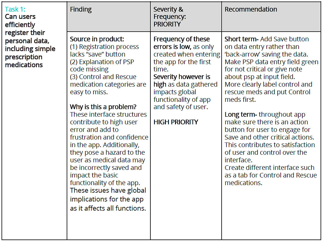
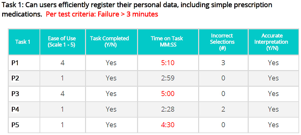
Results of usability testing (Task 1)
Task 1: Can users efficiently register their personal data, including simple prescription medications
Our first task involved the users going through the on-boarding process. They were tasked with entering demographic information and information relevant to the app. This included entering name, email, and gender as well as asthma specific information such as PSP code of their peak flow meter, their medications, and flow data.
Findings and recommendations of usability testing (Task 1)
Task 1: Users are often confused by the Registration interface, adding unnecessary time to task.
Participants liked the overall look of the registration interface, finding the simplicity of the design appealing. They generally understood the contents being requested in the input fields and forward arrows directing them to input additional information. However, quantitative results show some dissatisfaction, and qualitative results show that difficulty with the registration interface occurred in several micro-interactions.
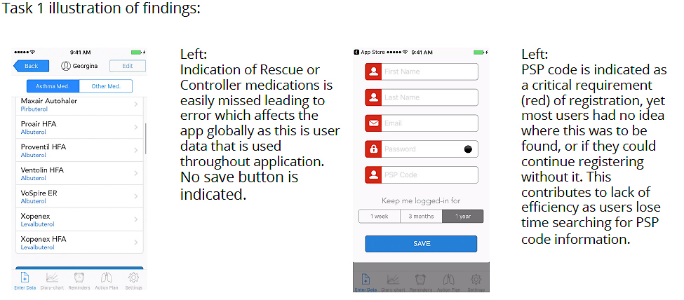
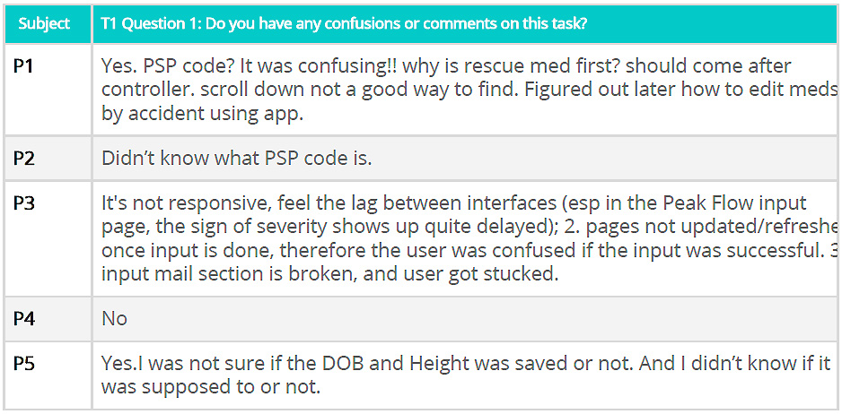
- First we learned that users were looking for a way to “save” their entry and finding none. The “Back Arrow” is not a standardized way to save an input. Said a participant, “Yes. I was not sure if the DOB and Height was saved or not. And I didn’t know if it was supposed to or not.“
- Participants also were confused by the request for a PSP code, losing time and patience while trying to resolve the request in the input field. Said a participant, “What is PSP code? Can I go on? Let’s look on Google!”
- And when participants attempted to enter data, such as simple prescription medications, the registration interface obscured the listing of controller medications. Said a participant, “It was confusing!! why is rescue med first? should come after controller. Scroll down not a good way to find.” And another participant noted, “in medications section, cannot easily get back to edit/revise the input, feel lost in the middle of action.”
Appendix data from usability testing (Task 1)
Included in Appendix were recording consent form, session script and forms, pre-test questionnaire, and final questionnaire.
COMPARISON STUDY ASTHMA MD
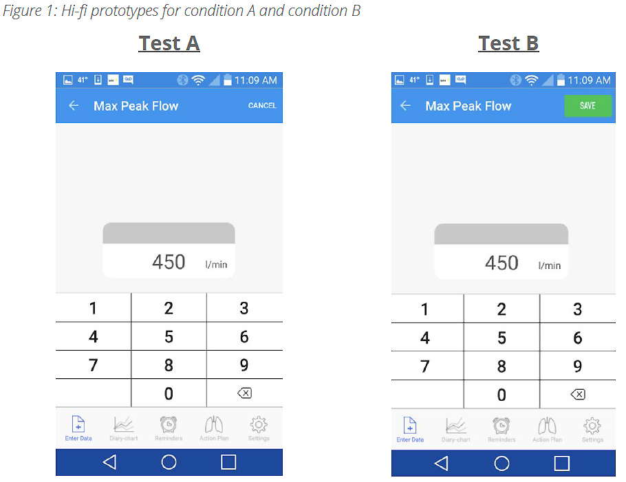
Compare which of two mobile interface styles, a Back-Arrow or Save Button, is more efficient for users in registering their Peak Flow Meter data into the AsthmaMD application. A key issue that emerged from original testing was the lack of sufficient user feedback in the application, specifically during the registration process.
In this study we conducted a comparison study to determine which feedback mechanism is better suited for affording users the ability to save data that they input, and then to confirm their changes have been saved. The study was presented using two hi-fidelity prototypes, once using a Back-Arrow for saving information, the other using a Save Button. The current AsthmaMD app utilizes the Back-Arrow functionality. Our goal is to evaluate both interface styles, to determine which is more efficient, and which better affords the user the understanding that their information is being saved.
Comparison study method
To understand user's response on the two conditions of registering the asthma peak flow data and to analyze the test results, we will conduct a between-groups comparison test to collect the time on task for each condition and develop a T-test to determine the test significance. Five experimenters will conduct the comparison tests individually by testing two participants per condition and gathering a total of 20 data points. The study will test on one dependent variable: Time on Task with two conditions as follows:
- Condition A- A 'back arrow' saves the user's newly entered Peak Flow number in the Android version of an AsthmaMD mobile app.
- Condition B- A 'save button' saves the user's newly entered Peak Flow number in the Android version of an AsthmaMD mobile app.
Materials
The prototypes are created with Axure and designed with a small subset of screens with limited functionality. The link and screens are as follows ( Figure 1 ).
Each experiment will record the data of time on task and input all the data points into a googlesheet for the further statistical analysis. T-test will be used to compare and analyze the test results to determine if a significant difference in time-on-task between completing Condition A or Condition B
- The Null Hypothesis: There is no significant difference between time on task for Condition A and Condition B.
- The Alternative Hypothesis: There is a significant difference between time-on-task forCondition A and Condition B.
Statistical Analysis
Each experiment will record the data of time on task and input all the data points into a googlesheet for the further statistical analysis. T-test will be used to compare and analyze the test results to determine if a significant difference in time-on-task between completing Condition A or Condition B
Statistical Analysis
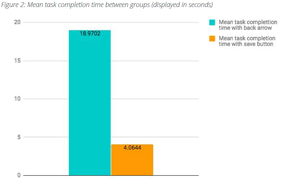
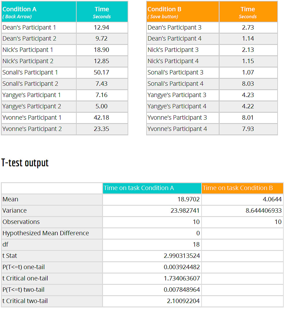
Our participants were split into a between groups study with half our participants (n=10) using the back button to save data, and the other half (n=10) using a save button to complete the task. We measured time to complete the task as our dependant variable.
We conducted a t-test to compare two groups of participants (those saving data by clicking the back arrow and those saving by clicking the save button). We found a significant difference (t (18) = 2.10, p = .008), such that participants who used the save button were able to complete the task faster (M = 4.06, SD = 8.64, 95% CI [0, 11.32]) than participants who used the back arrow to save (M = 18.97, SD = 23.98, 95% CI [0, 39.13]). Based on this analysis we are able to reject the null hypothesis that there will be no difference in time on task between the back arrow and the save button as conditions to save data.
Findings and recommendations of the AsthmaMD comparison study
Based on the results of the t-test conducted we found that the participants who used the Save button (Condition B) could complete the task faster than participants who used the back-arrow (Condition A) to save the data. We observed significant difference in time-on-task between completing Condition A versus Condition B.
Similar usage of back-arrow button for saving has been observed in executing several important tasks throughout the app. The problem pertains to navigation, lack of a call-to-action button, improper labelling of the buttons (e.g. iPhone versions use ‘Enter Data’ near the back-arrow). All of these problems can be resolved by placing a Save button on the page where medical data is entered by the user and using back-arrow to work as a Cancel button or for taking the user back to the previous page.
AsthmaMD mobile app research highlights
- Full range of usability testing
- Methods with users and without
- Strong comparison outcome
- Combination of both quantitative and qualitative methods