Challenge
Company
Symbria
Team
Hien Do: Software Development Manager
Jackie Malek: Marketing Director
Yvonne Nillissen: Senior UX Designer
Boris Remus: Senior Software Engineer
Sandy Stoub, MA AEA Director of Wellness Services
My Role
Strategy and research, sketching, wireframing, static and interactive prototypes, user testing
Symbria is a company that serves the needs of senior health care facilities, providing rehab, pharmacy and analytics services.
Symbria needed to move a paper workbook well-being screener process to an online environment.
The original screening workbook consisted of 9 research-based assessments that were used to help seniors match their cognitive and physical abilities to the ideal living environment. Challenges included a process that played out over an extend period of time with complex inter-personal interactions. Users were found to be somewhat resistant to a change in format, and finally, users needed easier access to well-being results and reports.
Solution / Service-Match
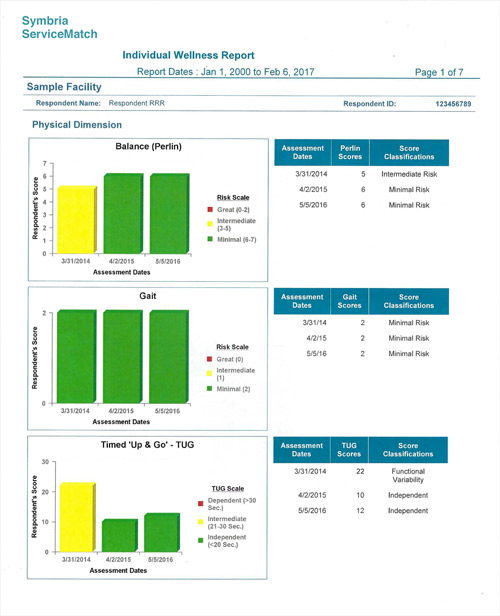
A seniors well-being assessment that can be conducted both online and 'in the field.' The assessment does not stand alone, but is used as a tool in conjunction with seniors and family input. The app is used by a trained facilitator working with a resident of the senior-care facility. A well-being report can be easily accessed by users and is compiled over time to show results and notes from previous assessments.
Service-Match Key Features
- Conduct assessments on an individual respondent over time. There is the ability to compare results over years of observation.
- Assessments are from optimal cognitive and physical well-being research for senior populations. Research study details are footnoted.
- User has view of assessment progress/system status.
- Notes can be made on all screening areas of the assessment. These become part of the wellness report, and are especially useful during discussions with family and for noting behavior changes over time.
- A sidebar shows screening results as assessment is underway.
- Well-being report that can be easily accessed by users.
Service-match Research
Visualize internal data for stakeholders
Initial research was business strategy focused and centered on estimates for time and cost of the current process. Resources required included printing and distribution of the workbooks, time for Symbria employees to access, print and send the well-being reports to the senior care facilities, training, and customer service.
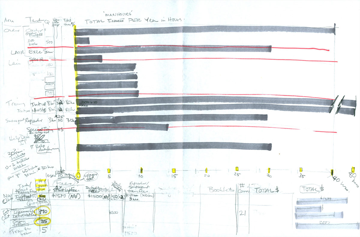
Rough thinking to visualize Symbria current workbook costs.
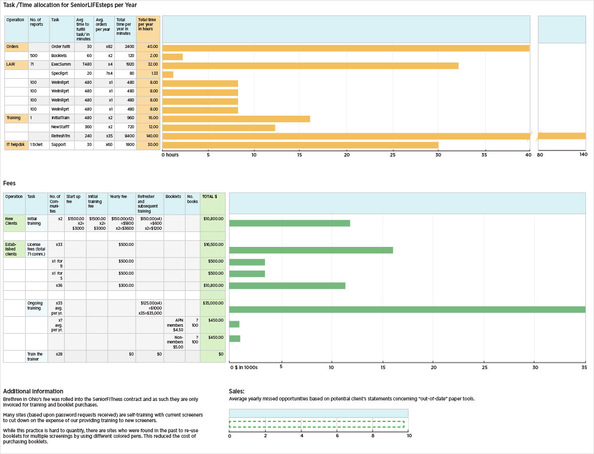
Final chart showing time, task, fees and missed sales opportunities using the current paper based workbook.
With insight gained from the visualization data, it was determined that a digital environment would be more cost effective than the printed workbook and promise additional benefits. Competitive insight found no existing comparable tool. Portions of the test are public domain, but no company has gathered them in a similar way. Test validity was proven in a court case. The tool uses evidence-based, research-proven sources, and these are noted prominently on the test itself.
Interviews for Service-Match
The Symbria Director of Wellness Services had been gathering feedback from existing clients for a number of months. When discussing the possibility of a digital version of the assessment, facility leaders expressed interest in the idea but had concerns over how the product could serve their residents over the long term. The current booklet was used to store notes and scores from previous years. Additionally, it was used in discussions with residents and their families. Facility managers were also concerned about seniors interacting with a digital device rather than using familiar pencil and paper.
Strategy
The new improved digital assessment tool would be an upgrade offering to current clients, and help to engage new clients. Measurable performance indicators will be an increase in the number of new clients within a 6 month period, with corresponding revenue increases. The product is positioned as a bridge to other Symbria services.
Symbria supplies its senior-care facility clients with iPad-minis for use by their staff. In context, the user is often moving throughout the facilities communicating with residents. To conduct assessments with residents, the lightweight portability of the tablet is an advantage as is the touch screen capability. Touch screen allows for direct interaction on the 9 cognitive and physical assessments. The ROI of the product is high when booklet printing, shipping can be eliminated and wellness-report administration greatly reduced.
Research Insights for Service-match development
- A digital online version of the well-being assessment will save on costs.
- Current clients receive a product upgrade.
- New clients can be easily engaged with the product. It can also act as a bridge to other Symbria services.
- While portions of the assessment are public domain, no competitor has gathered them together to create a similar offering.
- The need for touch screen interaction and lightweight portability point to use of ipad minis already being used by client facility staff.
Ideate
Sketches for Service-Match
Symbria clients are supplied with iPad minis, as many staff are working throughout their facilities while needing access to Symbria enterprise apps. Concepts were roughed out for the ServiceMatch app. As outlined in the business strategy, iPad portability and touch screen interactions would allow trained staff to meet residents where they lived and conduct assessments without paper or pens saving time and money. Each of the 9 assessment areas could be conducted on the app. All results would be stored immediately and available for review.
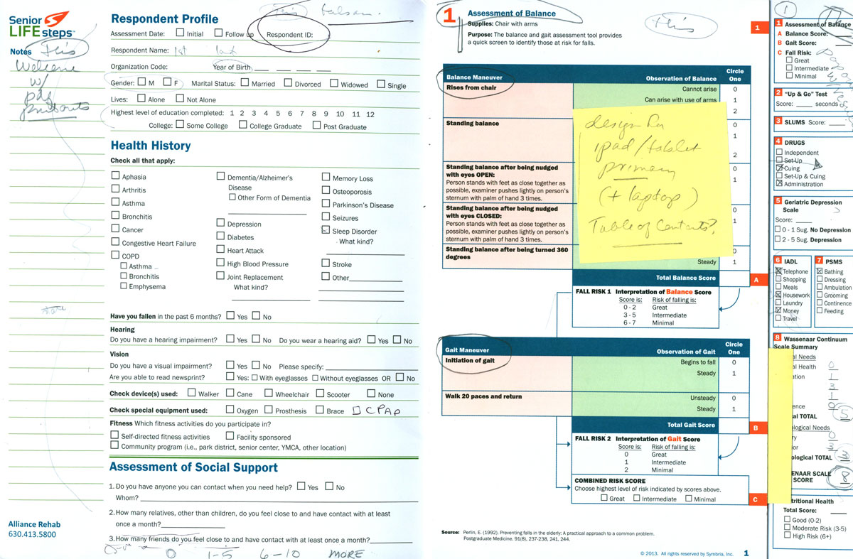
Original Senior LifeSteps Workbook (later re-named ServiceMatch).
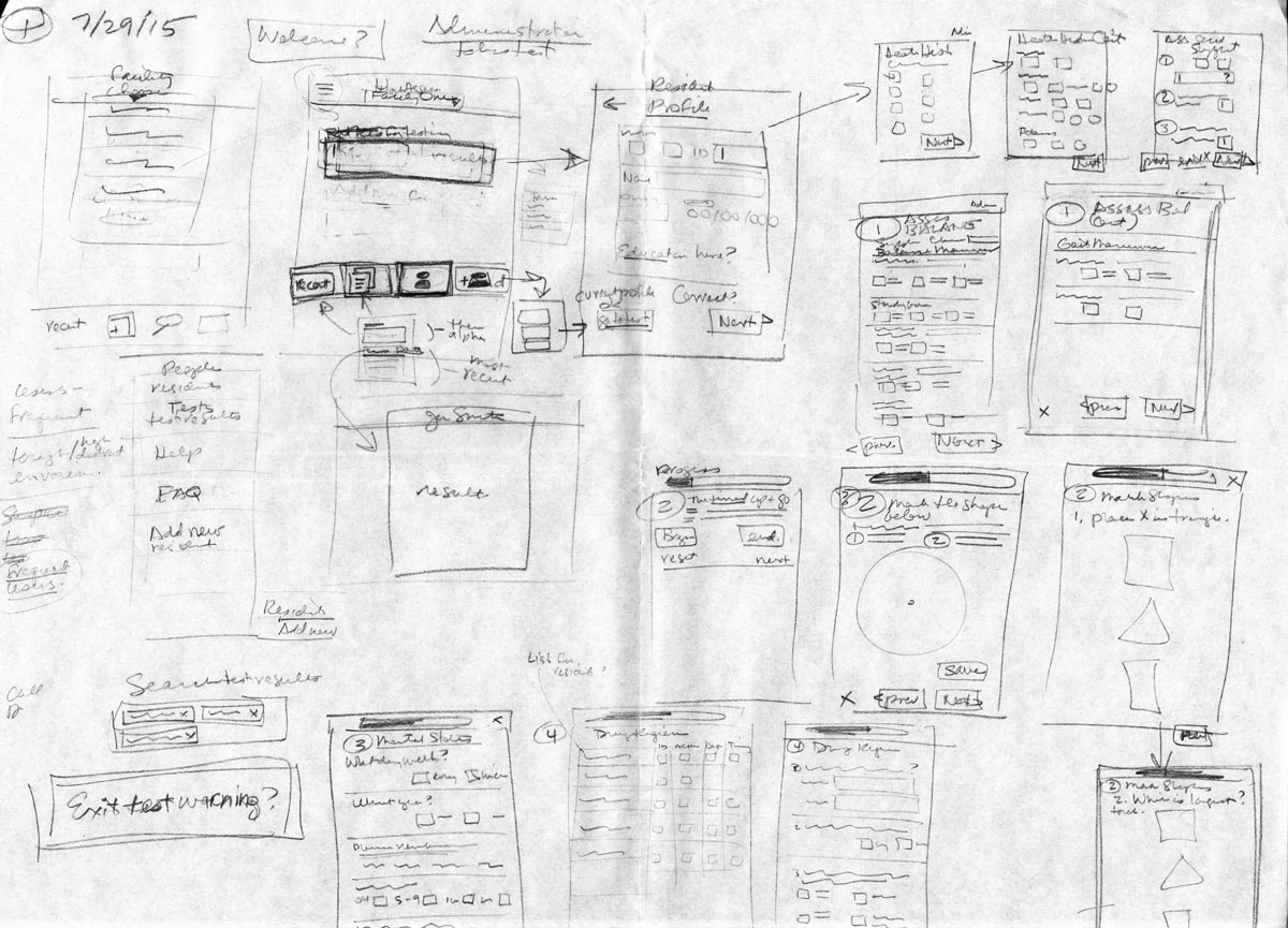
First sketches for a digital mobile version of the well-being assessment.
Prototype, test, iterate
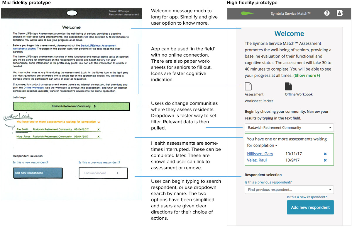
Service-Match low- to high-fidelity welcome page
After logging in to the Symbria portal and clicking the app tile, the Welcome page was the first exposure to the ServiceMatch app. The app UI was designed following Apple Developer Human Interface Guidelines. Clarity, deference and depth are valued and promoted. Appearance and behavior are not separate goals but integrated and aligned with function. Throughout the experience, the user was in control and could understand how to achieve objectives.
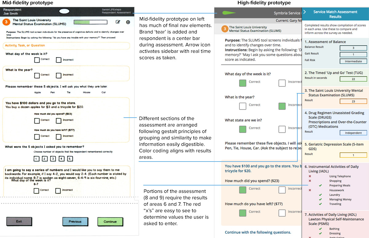
At the mid-fidelity prototyping phase, on-going discussion with facility managers and staff changed the direction of the app somewhat. It was determined that seniors would not be comfortable using iPad touch to conduct some of the cognitive tests directly on the device. For these two assessments, worksheets would be printed out by the facilitator before the test, and used by seniors with pen/pencil and paper. Below are some of the details used in the UI to achieve these goals.
Service-Match high-fidelity navigation page
Navigation for the app is hierarchical. Information was clustered left to right by most critical information, helpful information, and actions. Once the user is taking the assessment, there is no access to the administration page and interactions are limited to those required for the test.
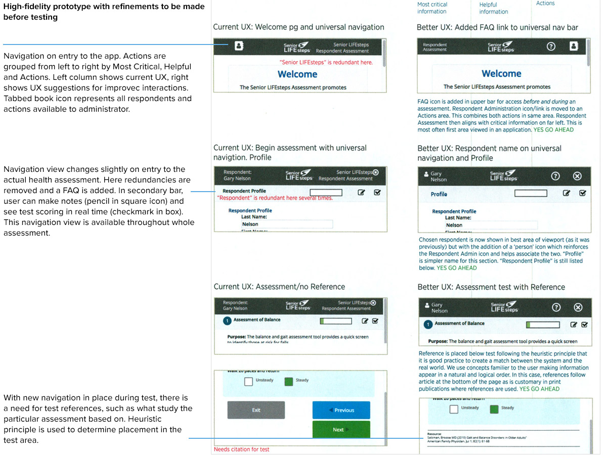
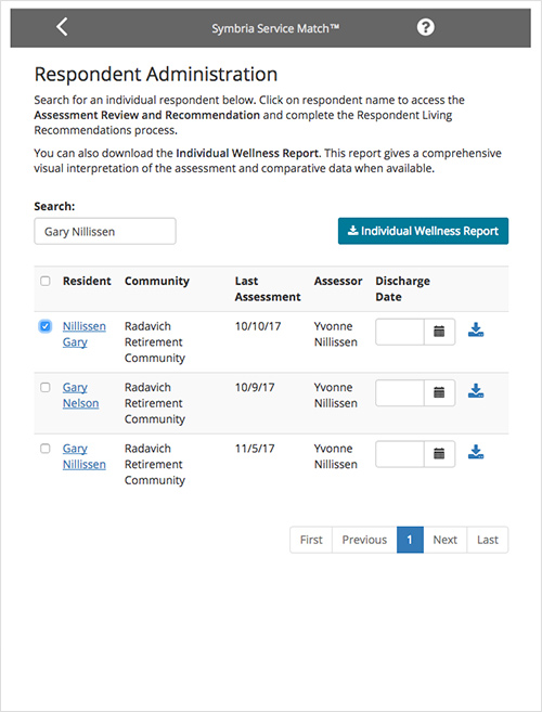
Outside of the test, the Welcome view navigation links to Administration and the Individual Wellness Report.
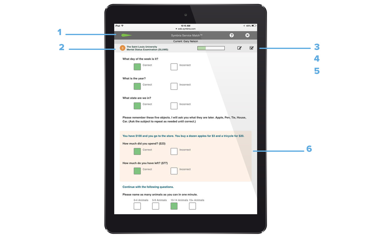
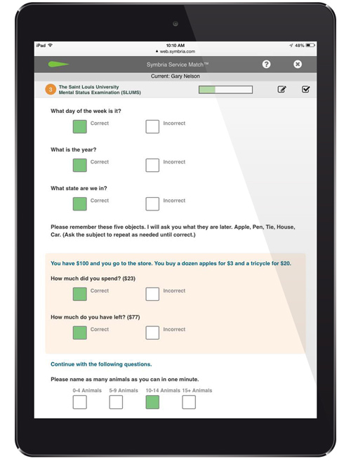
Low- to high-fidelity assessment areas prototypes
The facilitator and senior resident move through the 9 assessment areas together. The facilitator is trained by Symbria in all of these areas. The Apple UIkit is used for keypad, notes and results slide-out panels.
Testing of the Minimum Viable Product
A MVP was released and user tested with 5 participants. One test was conducted in person and four through webinars. General field notes were taken. Results were compiled and observations were assessed directly by Symbria management. Post-test changes were made to the product.
Service-Match MVP Results Insight
- Users wanted the ability to print out reports.
- Users should be able to return to the test if interrupted.
- Assessments must be available for use offline.
- There must be easier access to individual reports.
Service-Match Retrospective
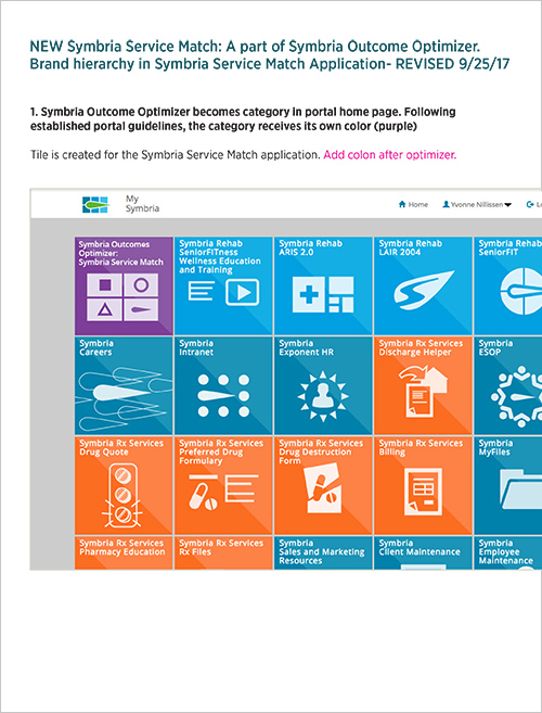
The app has fulfilled its goals. There is a strong adoption by existing clients and new clients try the product and bridge to more of Symbria's many services. It can be found on the Symbria website: ServiceMatch Outcomes Optimizer.
Below are snapshots of the mobile version and a view of the app tile in the Symbria portal.
Project video
A video was created to explain the features and use of the product. This video was distributed via webinars conducted by the Symbria Wellness team. It serves to ease transition from the booklet based system and as an on-going training tool for the product.
Script creation and video production was a UX responsibility. Script was edited by the Director of Marketing. Video narration and all editing was done using ScreenFlow software.
Room for growth
A solid and experienced team made working on the Symbria ServiceMatch app a pleasure. The UX process was championed by wellness leadership.
Some improvements could be made. Early in the discovery phase, the project relied on manager input rather than research with actual users. Additionally, testing with users during the lo- and mid- fidelity prototype phase was not conducted and would have been valuable. A key finding where users wanted access to individual reports would have been discovered sooner. Future work includes additional usability testing for efficiency and ease of use.
Service-Match Project highlights
- LeanUX principles were incorporated where leads from teams across the company were represented on the project.
- Business strategy was translated to UX goals.
- The Apple iPad UI followed Human Interface Guidelines.
- Product stayed true to Symbria's larger mission and goals: serving the needs of senior-care facilities to make their senior patients safer and healthier.