Portal Challenge
Company
Symbria
Team
Rich DeJong: CTO
Hien Do: Software Development Manager
Jackie Malek: Marketing Director
Yvonne Nillissen: Senior UX Designer
My Role
Brand identity, sketching, low-to-high fidelity prototypes, html/css, testing, global style guidelines.
Symbria has three major business lines serving senior healthcare facilities. Rehab, pharmacy, and business services. Senior stakeholders wanted a change to the current systems gateway to better reflect the future vision of the company.
Many of the business service lines have exclusive enterprise software written specifically for unique industry demands. Clients were accustomed to logging in to the current Symbria gateway to access their custom software. The new Symbria portal would be used by employees and clients to connect to these services and more. Global features under consideration were access to apps, custom settings, mail, messaging, about us, tours and help.
Strategy
Senior stakeholders wanted a change to the current systems gateway to reflect the company as forward-thinking, technologically advanced, fresh and smart. Symbria was positioned in its market as a leader. Competitors were upgrading their offerings in many areas including technology. It was critical that the daily contact point between the company and its clients reflected Symbria's new vision.
Solution and Key Features of Portal
- Portal navigation and identity. Interface is fresh, technologically advanced, and accessible.
- Post-login features are: helpdesk, password reset, IP address, portal tour
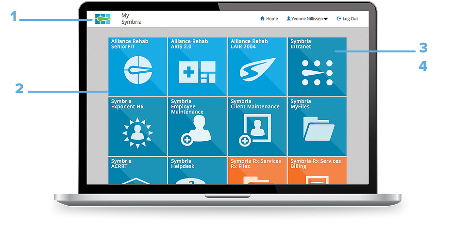
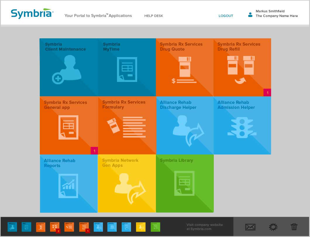
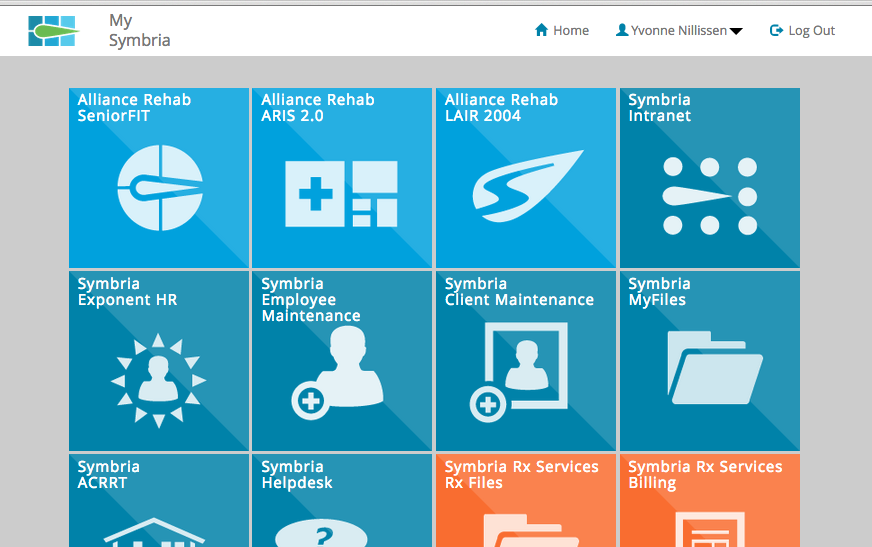
- Tiles are permission based. User sees only tiles that are personally needed. Portal home UI can support a single or unlimited number of tiles.
- App tiles arrange by Symbria business line. Unified design supports the Symbria vision of a single company offering a breadth of products and services.
- Aesthetic and minimalist UI design supports the most relevant information while minimizing distraction.
research for portal development
Research included discussions with internal and external stakeholders on user needs and expectations. Additionally, an expert heuristic evaluation was conducted on the gateway login and home page processes. The findings are shown below.
Heuristic review
The original login review
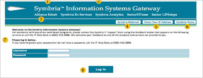
- Consistency and Standards: Symbria logo. Use new Symbria logo consistently across portal and apps.
- Use familiar metaphors and language: Information Systems Gateway: Perhaps a friendlier description of what portal does for users, such as "Your Symbria App Portal" or similar.
- Consistency and standards: Removing list of Symbria partners. These now read as links if we follow web common standards. Linking to appropriate website pages also takes you away from the portal at very high navigation level. Upon login, relevant partners could be visible as part of app tile organization. Consider if function of list is relevant to larger strategic goals.
- Help and documentation: Consider moving this information to Help link. Also move forgotten password copy closer to password entry.
- Aesthetic and minimalist design: Group username, password, and login fields together following gestalt law of proximity.
- Error prevention and Aesthetic and minimalist design: Webmail app may be misplaced as part of primary navigation. Consider placing with other functions/options of MyFiles app. Icon rather than copy would also help recognition and help users to avoid errors.
- Help and documentation and Familiar metaphors and language: "Check your IP address" is out of place in primary navigation. Move to Help link or button. Consider moving to options/settings.
- Error Prevention Symbria Home is unclear as a link name. Does it take us to this page throughout the app, or does it go somewhere else? Being taken to the Symbria Webpage comes as a surprise.
The app homepage review
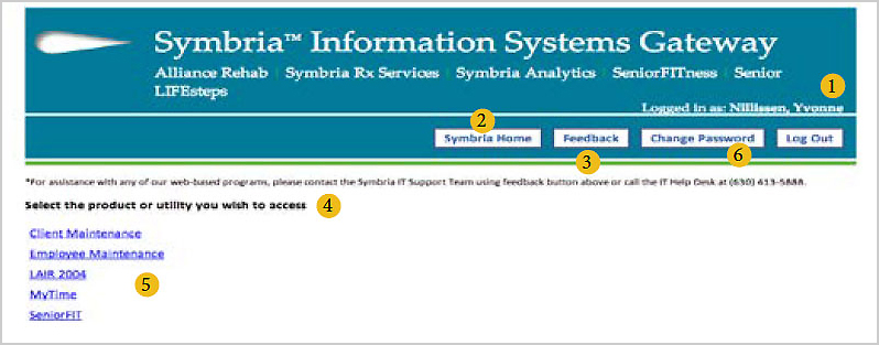
- Aesthetic and minimalist design: Login status is lost here. Consider giving a clearer placement in layout.
- Consistency and User control and freedom: Symbria home link has moved from its place on login page. Keep in the same position to prevent errors. Does user easily return to portal once taken to Symbria website?
- Help and documentation and Help users recognize, diagnose, and recover from errors: The feedback button is really a Help button. When users offer real 'feedback' is there a response mechanism? Can feedback be placed in options/settings or within help window?
- Use familiar metaphors and language: "Select product or utility" text could be friendlier. Maybe "Choose the app or apps you need to use."
- Visibility of system status and Flexibility and efficiency of use: Consider a way to group apps, making their function and relevance simple to the user. Can the user tailor frequent actions?
- Familiar metaphors and language: "Change password" could be commonly grouped into settings/options function.
The portal user persona
Personas were created based on frequent dialog with client and Symbria employee managers. Below is persona for the client user.

Persona: Steve is a senior facility financial manager who watches costs while maintaining a range of services.
Demographics
- Age 42
- Status: Married
- Location: Northfield, IL
Bios
Steve is the busy financial manager of a large senior-living facility with many levels of care. He doesn't have a lot of time and needs to see his business invoices quickly and be able to compare them across many months.
Goals
- Use the Symbria portal to access his business services apps.
- See at a glance where to login to his business information.
- Know where to get help quickly if there is a technology problem.
Frustrations
- Time spent logging in and finding his Symbria software. Some key actions are inconsistent.
- Needs to keep up with latest technology and software in his field.
Ideate
Sketch the portal interface
With research insights in mind, the team began to ideate, creating sketches of the portal UI.
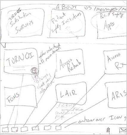
Stakeholder meeting idea
Idea for tile grouping by business lines
More ideas for portal form, function, and style.
Initial portal design ideas included dual nav bars and additional features like app alerts, mailbox and tile customization.
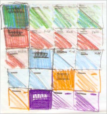
Mid-fi style design and portal identity sketching
Prototype with dual nav bars and app alerts
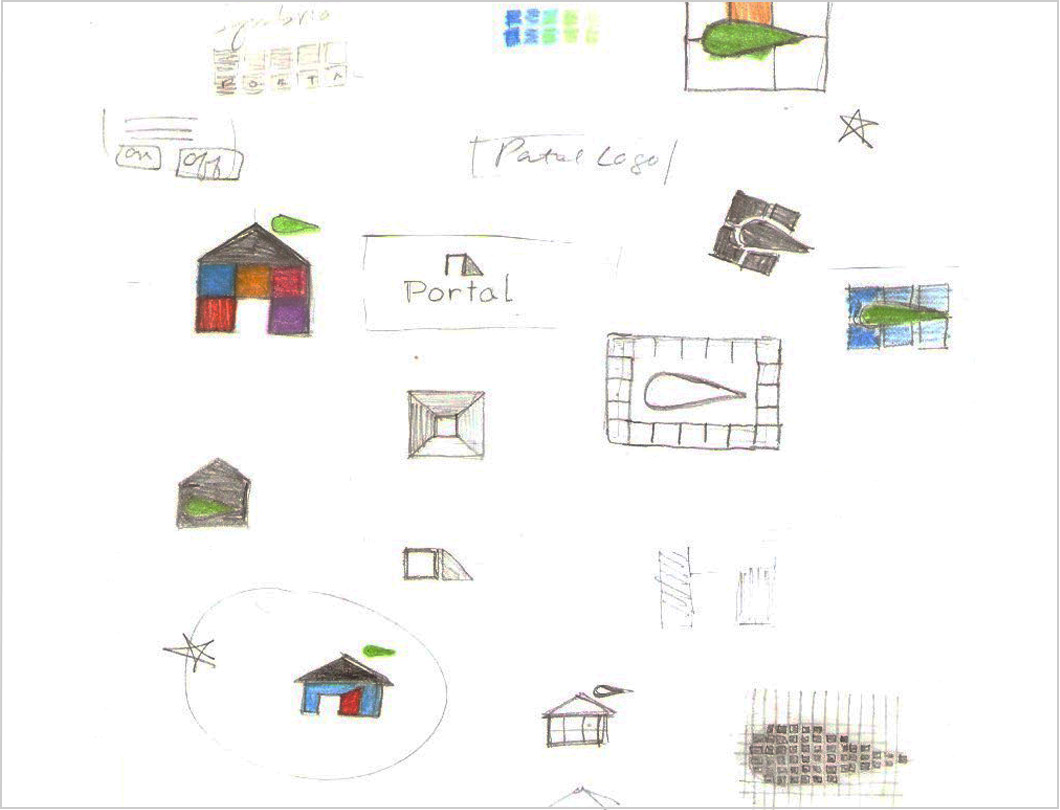
Concepts for portal identity
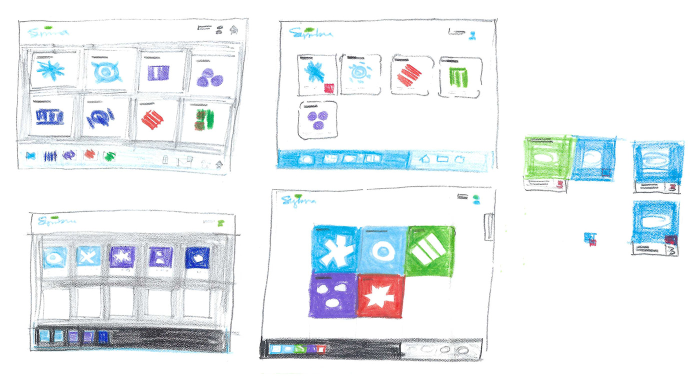
Mid-fidelity prototypes
Many iterations of the portal design focused on alerts to the user from individual apps. User could also set preferences from within each app and also set preferences on the home page. These included tile color, name, and placement.
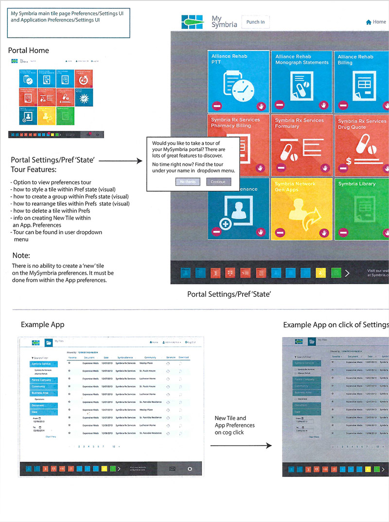
Mid-fi prototype explores tour of preference settings

Home and app page preferences settings UI.
High-fidelity prototypes
High-fidelity iterations focused on pre-login functions of help and IP address. Once logged in, interface was refined on welcome, app headers, alerts, messenger, and settings.
Settings included a home page 'state' where widget could make style and function changes desired by the user.
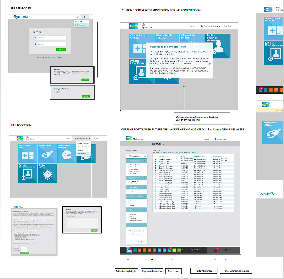
High fidelity prototype features and flow
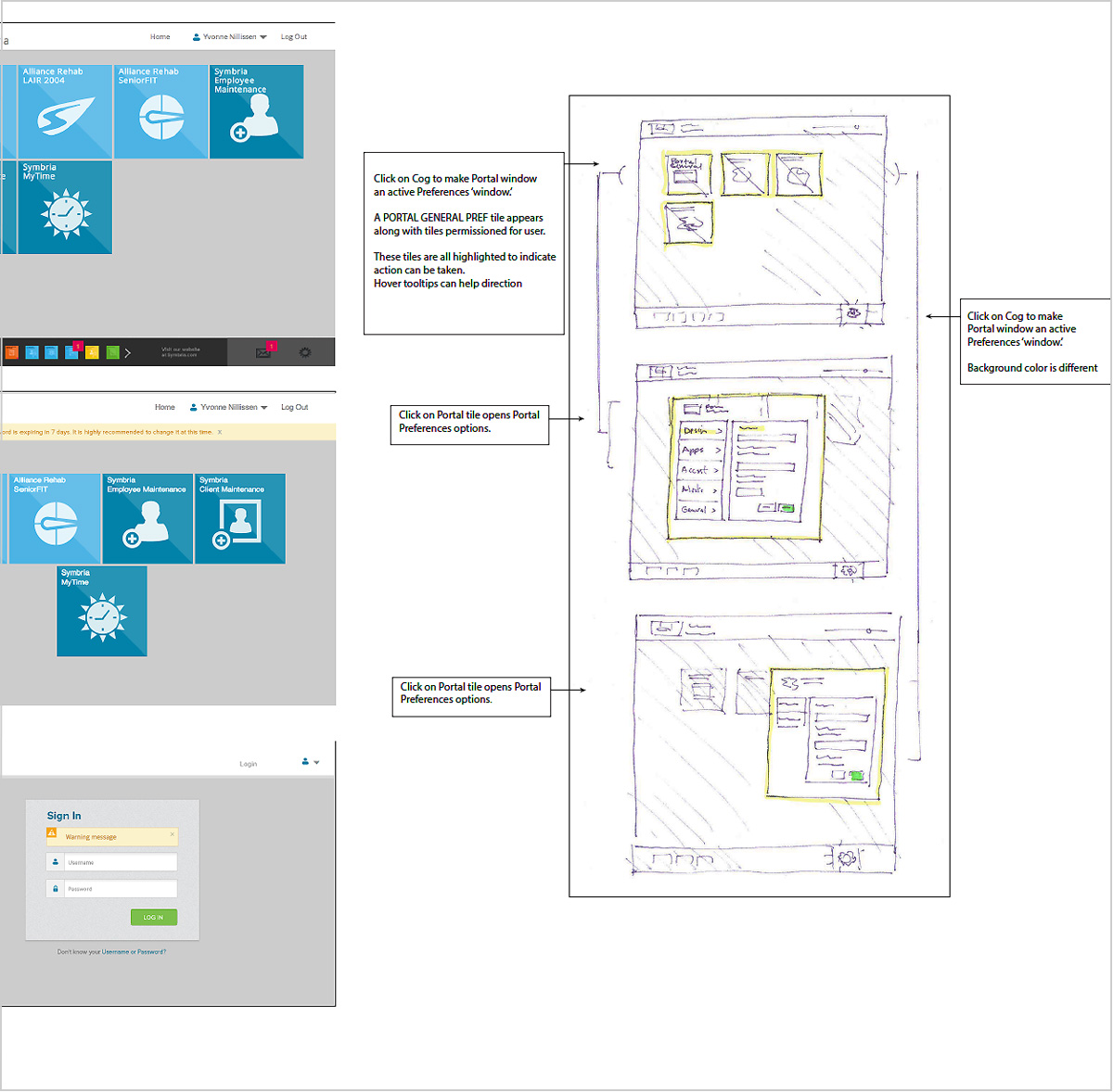
High fidelity prototype global warnings, preferences state and settings
Portal UI highlights
- Redesigned login and pre- and post-login actions.
- A consistent portal header for all applications.
- A dual navigation UI with access to login and help plus app alerts and preferences settings for homepage and applications.
- Style direction for app tiles and icons plus business line placement and grouping on homepage.
Global Styles
Consistency and standards for portal and all Symbria applications
The portal was published and the global portal and application style guidelines were set. These included alerts for home page and within applications and various functions such as password reset and general entry errors.
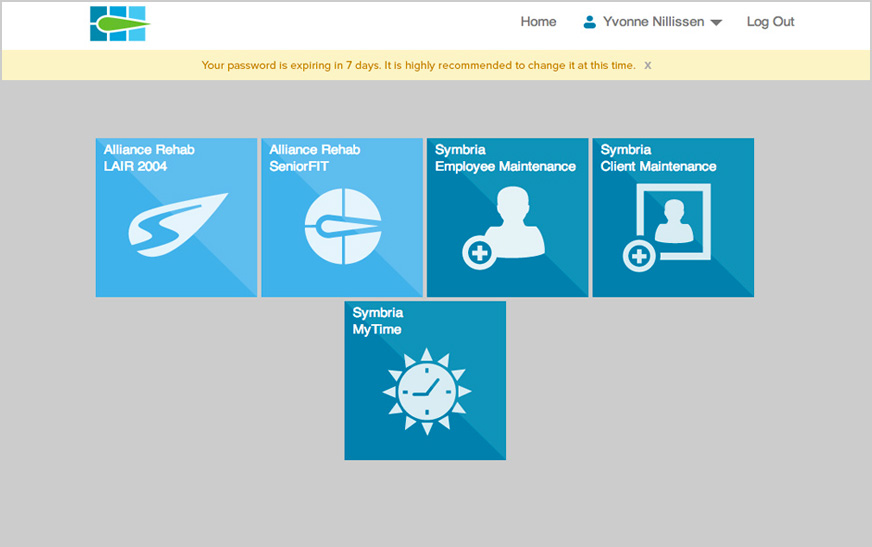
The published portal
Global alerts were designed
Global application styles template
Symbria's many enterprise apps lacked consistent visual and action standards. Users needed to be sure that words, situations and actions meant the same thing. The app design standards addressed this need. Platform conventions were kept consistent.
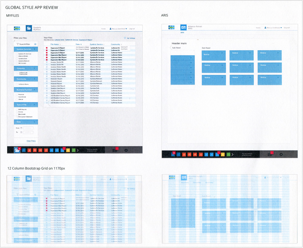
Application of global styles using grid format

Global styles for action and function
Application style guidelines
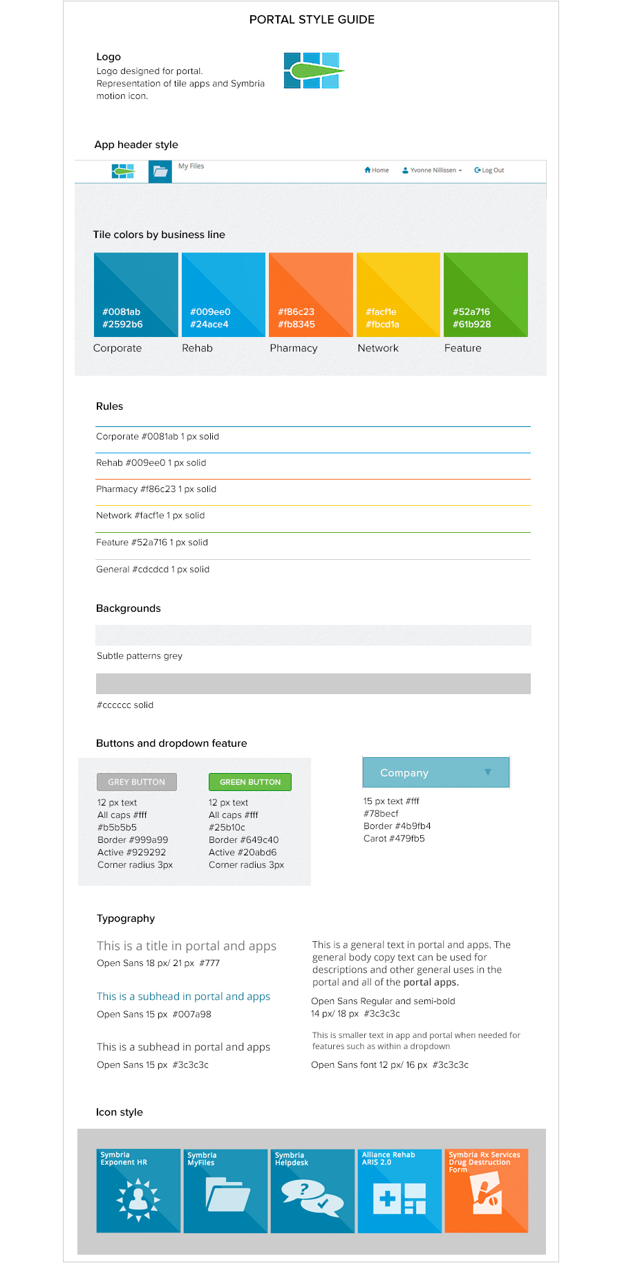
Detailed style guidelines for typography and color
Portal Enterprise apps
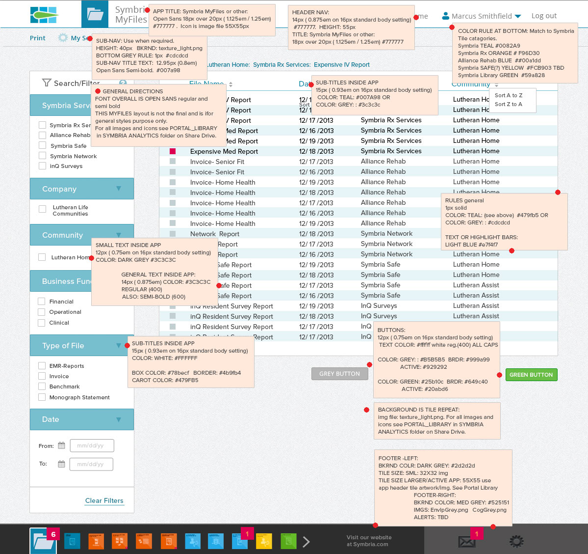
Use of style guidelines in Symbria app
Example below shows Symbria app with style guidelines applied. Going forward, these style guidelines would be applied to all new applications.
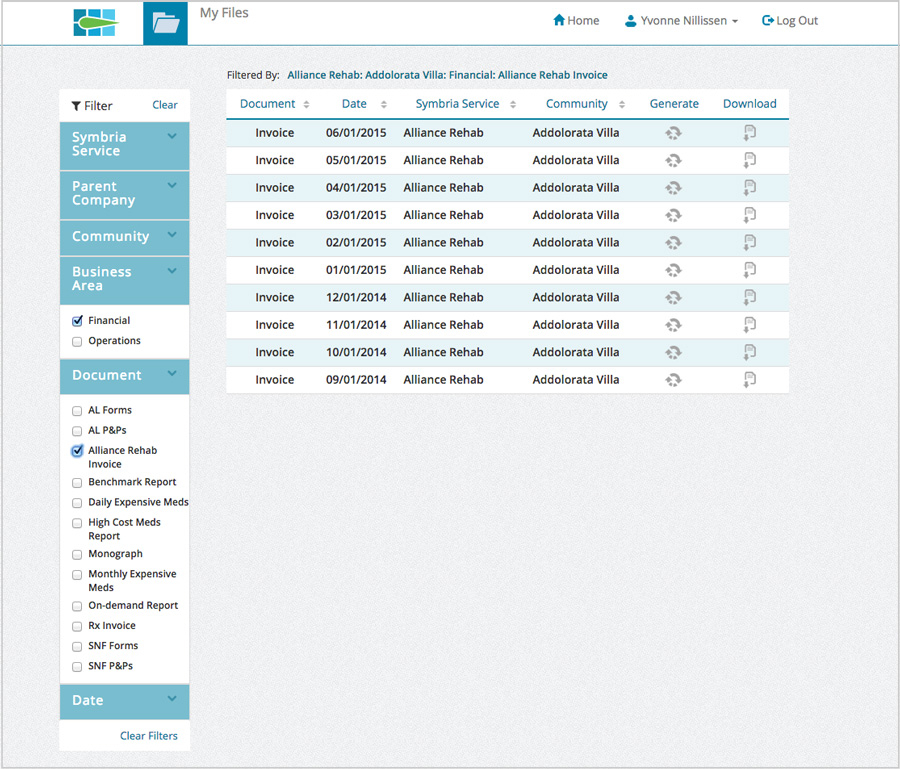
MyFiles Symbria application with global style guidelines applied.
retrospective
Portal use
The portal was published and adopted by Symbria clients and employees. A flexible system, it adapts to new user needs as apps are added or retired from use. A custom loader was designed to reinforce the Symbria brand.
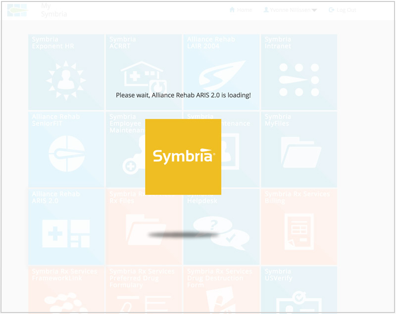
The custom loader reinforces the Symbria brand.
Portal Tour
When users logged in for the first time, a tour of the portal features was provided. This tour could be stored in the navigation area and accessed at any time. This action was consistent for individual app tours as well.
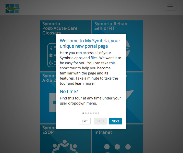
The welcome message
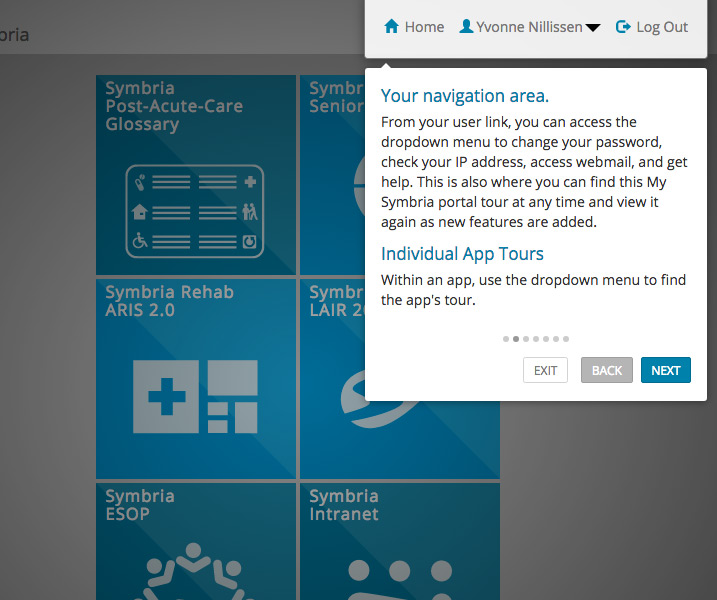
Example of tour stage
Room for growth
The development of the Symbria portal was a challenging project produced over several months. A lean team combined representatives from all business lines of the company, IT, UX and marketing. This allowed iterations to be made quickly at all phases and the project to progress well. The flexibility of the system is one of its strengths, and the global styles have brought a consistency to the Symbria interfaces that was lacking.
In producing a minimally viable product many features that were part of the design process were ultimately shelved. These included a messaging system and app alerts. The final product also did not include preferences settings by the user.
If another portal design were undertaken, more research should be conducted on the features most needed by the users and these could be prioritized.
Symbria Portal Project highlights
- Team worked in LeanUX, where representatives from leadership, marketing, development, sales and UX worked together. Agile development practices were followed.
- Symbria strategy goal was achieved. The portal continues to be market leading, forward thinking, fresh and smart.
- The portal is flexible and can grow and adapt with company and user needs.
- Product also stayed true to Symbria's larger mission: serving the needs of senior-care facilities to make their senior patients safer and healthier.