Challenge
Company
The Manpower Group: Manpower
Rightpoint Team
Kosta K.: Director of Experience Design
Liz H.: Product Manager
Miku K.: Associate Design Director
Stephanie A.: Visual Designer
Jeff P.: Content Strategy
Yvonne Nillissen: UX Designer
My Role
Personas, architecture, ideation, wireframing, interactive prototypes for mobile and desktop
Manpower is the world's third largest employment staffing company. It focuses on contingent staffing and permanent recruitment. The company is different because of the career development, personalized guidance, and unique access to jobs it offers to employees.
The current website was experiencing difficulty competing with job-board website companies that appealed to younger candidates. In addition, the site lacked a singular focus.
The Rightpoint design team was brought in to redesign the website and create a design system that could be applied to both U.S. and overseas markets. The resulting design needed to be adaptable to meet the diverse requirements of the many countries where Manpower operated.
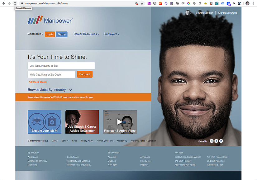
The legacy website
Many elements were competing for the attention of the user resulting in a confusing interface that was losing share to new competitors.
Solution
A website with simplified focus that makes job search a priority while differentiating Manpower from its job-board competitors.
- User can search jobs directly or take a guided path.
- Experience is optimized for mobile.
- Employers are given high level consideration.
- Navigation highlights the difference that Manpower makes for the job seeker and grouped action items make engagement more likely.
- The strong visual Manpower brand is reinforced and evolved.
Research for Manpower.com
First steps included mining existing Manpower research to gather insight into primary and secondary users. This research included:
Interview
Interview with key member of the Manpower team to ask questions such as:
- Who is the Manpower user we are trying to reach?
- Do users understand the difference between what Manpower offers and job-boards like Indeed.com or Monster.com?
- Does the Manpower user have unique needs?
- What is the benefit to the user to Join/Sign Up?
Documents
- Associate Journey Map
- Engagement Model
- Customer Experience research presentation 2019
Personas were created that focused the team on user goals. These personas took two paths; that of the Employer and that of the job seeker. Below are 2 examples of the four that were created.
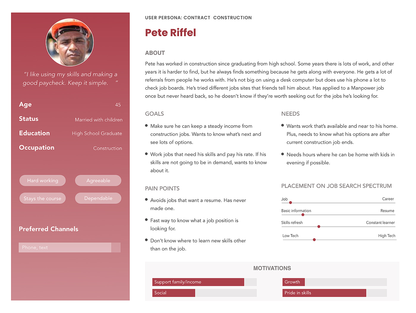
Persona 1 Job Seeker
- GOALS: This job seeker wants to be sure to secure a steady income. They want to know what's next and what the options are. Prefers to work jobs that optimize skills and meet pay scale.
- NEEDS: Job seeker needs to work near home. Wants to know options after current contract ends.
- PAINPOINTS: Job seeker doesn't know where to learn new skills other than on the job. Opportunities for learning on the job can be hard to find. Has never made a resume and doesn't know how to start.
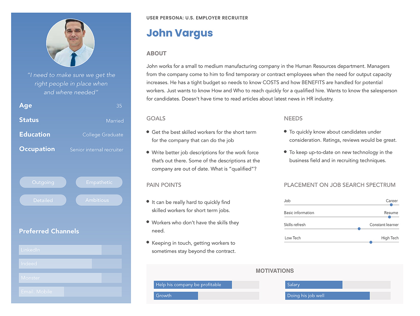
Persona 4 Business Recruiter
- GOALS: Business recruiter needs to get best skilled workers for short term needs of the company. Recruiter wants to create better job descriptions for higher response.
- NEEDS: Recruiter needs to quickly know about candidates under consideration. Needs better ratings and review. Keep up to date in new recruiting technology.
- PAINPOINTS: Recruiter finds it very hard to find the right skill set for short term jobs. Also, it is difficult to get some workers to stay beyond the original contract.
Competitive Research for Manpower.com
Job boards were a growing competitor for Manpower. The new MP site needed to include robust, intuitive job search and application flow functions. Research had to explore what competitors are doing well and also what Manpower should avoid given its unique users.
Research Insights for Manpower website
- The Manpower primary user tended to work from one contract to another. A continuity of employment is very important. Anything Manpower could do to reassure users of this capability would be very effective.
- Employer recruiters have unique needs and value personal relationships with Manpower representatives who can provide qualified and motivated job seekers.
- The user interface must be optimized for mobile. It must be fast, intuitive and able to gather information in a way that feels easy and assistive to users.
- It is important to help users understand why Manpower is truly different from job-board companies.
Ideate/Design for Manpower.com
Visual designers explored a fresh take on the Manpower brand while working within existing company guidelines such as color palette and typography. User experience worked with content strategy to create priority guides for each of the primary and secondary pages. The homepage was created early in the website design process.
Homepage iterations
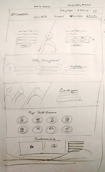
SKETCH
2 search options within the hero
The Manpower difference concept
Skills mapping need
Testimonials provide trust and engagement
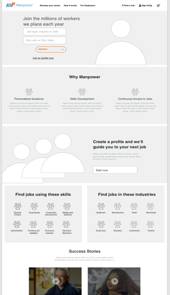
WIREFRAME
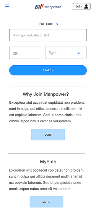
Search is primary action
A guided search option is available
Skills and Industry links exploration
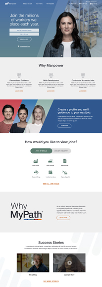
DESIGN
The guided search link in the hero
Plus a guided search section
Skills and Industry combined in 1 UI
MyPath differentiator prominent
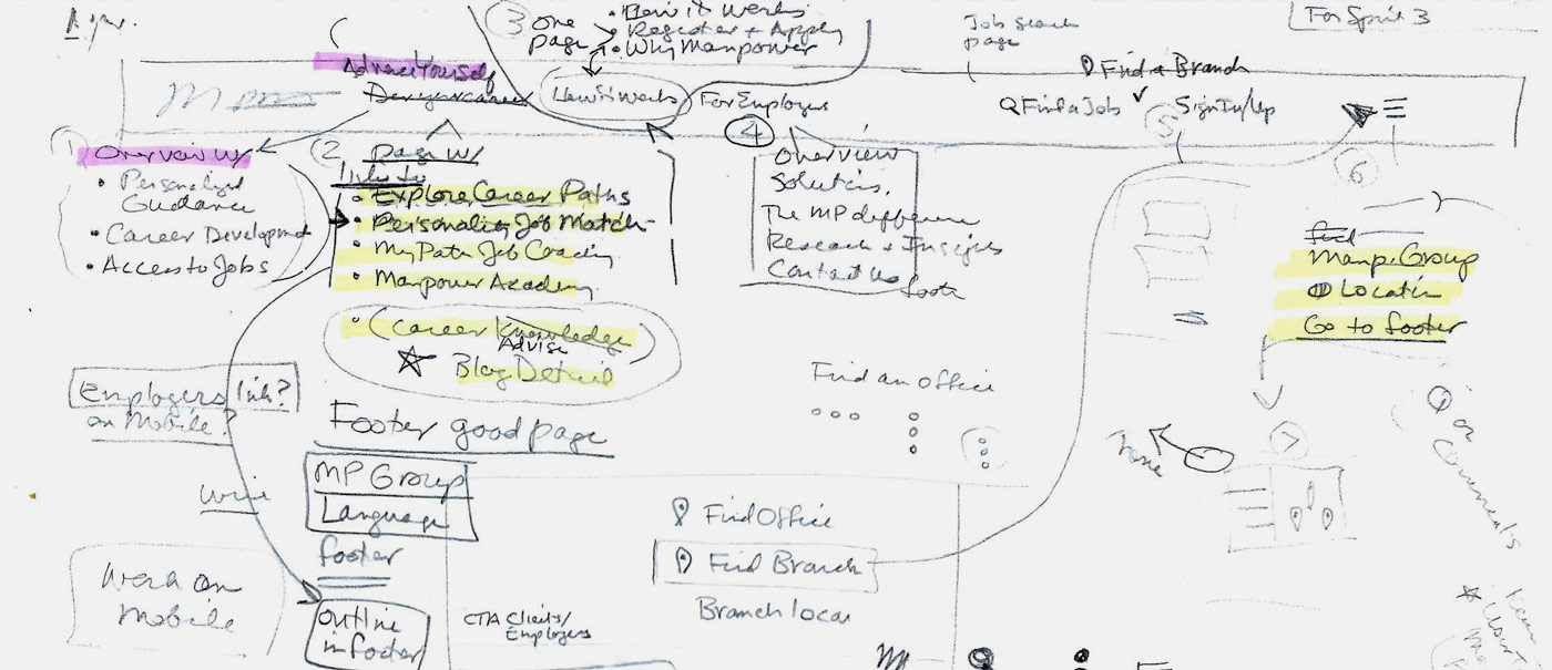
Navigation iterations
Legacy navigation was fragmented over several parts of the homepage and was inconsistent on secondary pages, breaking standard heuristic principals such as error prevention, consistency and standards and aesthetic and minimalist design.
This was corrected by simplifying the sitemap and sorting the programs and initiatives for easy discovery and exploration by the user.
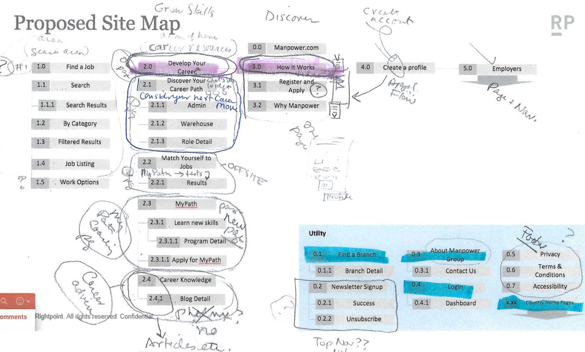
SITEMAP Some previously separate pages are combined and other pages eliminated.
IDEATION Links to secondary pages are organized and more effective labeling is used.
DESIGN Action items are grouped on right. Sign In/Up is combined in simple and effective UI widget.
Explore Search options
The team considered several approaches to job search as it was a primary function of the site. Human factors knowledge was helpful in understanding users' motivations and what might keep them searching successfully for a job and coming back to the site to search and apply again.
A search option with more filtering up front. As users see themselves moving closer to a goal they are more likely to finish. This also adds control and autonomy which users value.
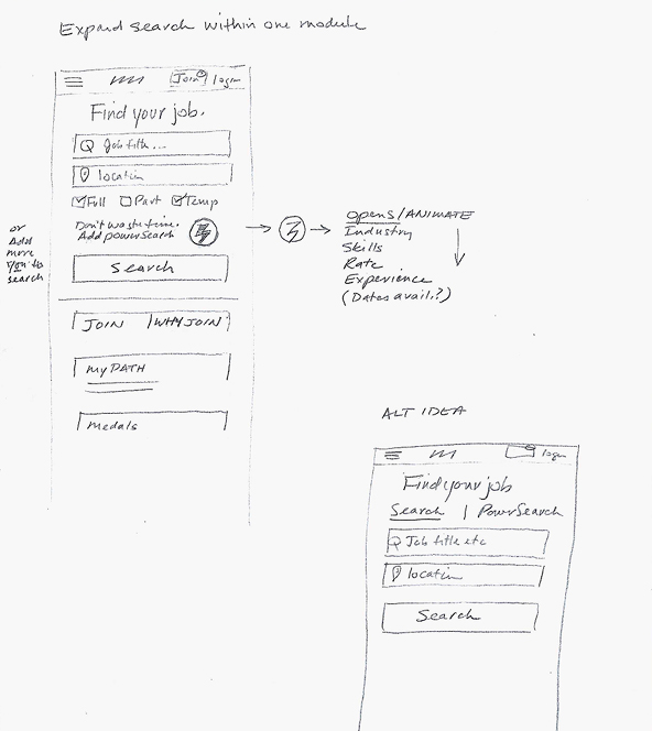
Also considered was a "power search" which asked the user to provide information in small chunks, increasing the likelihood of completion. UX was often looking for ways to avoid overwhelming the user with too much data entry.
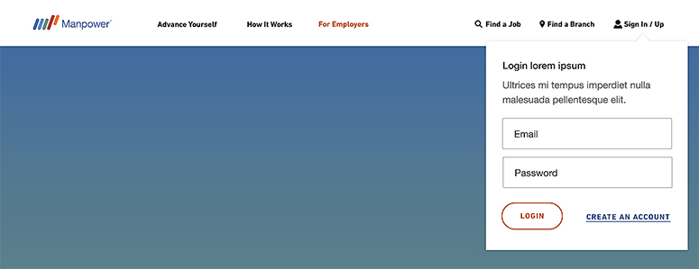
Filter
With an initial search design complete, the team considered many ways that the user could refine a search.
The job description provides the bulk of the information to the search engine; but zip is a simple way to target location. Type of job is a key filter for the Manpower job seeker (part-time, full-time, contract).
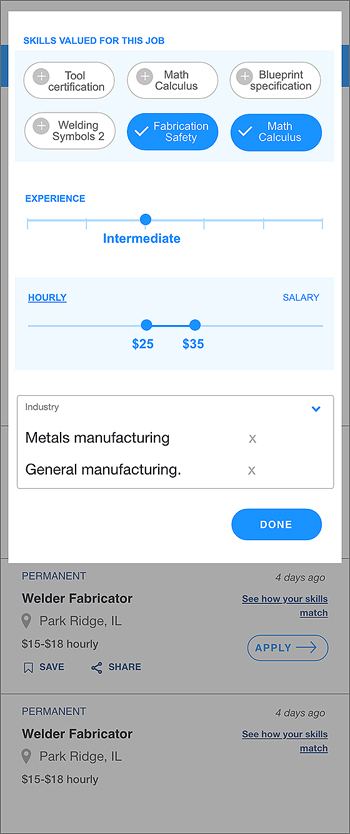
With a job title, the system is able to supply skills valued in that position. The user can simply recognize (not have to recall) their skills and add with a tap. Experience level and hourly rate or salary can be set with a slide.
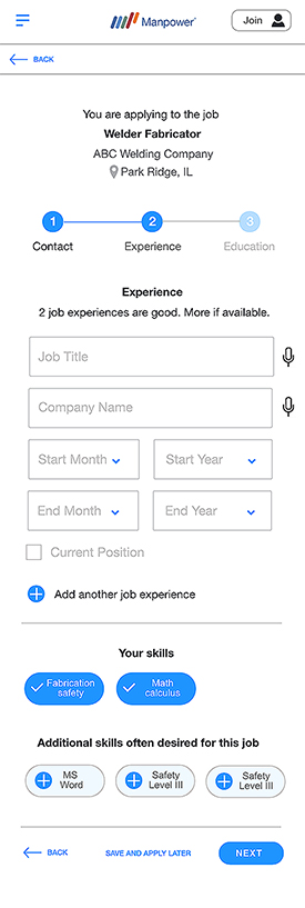
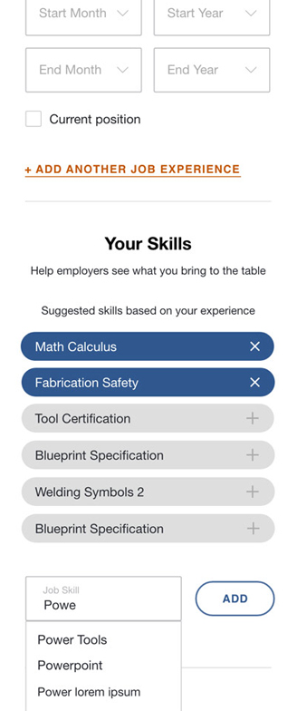
Application flow iterations
The Manpower application flow was used once a user found a job listing and took the step to apply to a particular job. The application flow needed to strike a balance between the data required from the user and the ability of the user to complete the form with easily and quickly with no friction.
SKETCH
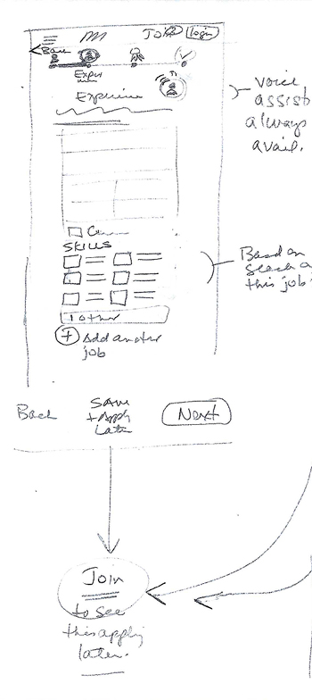
Use voice technology to capture data.
WIREFRAME
Skills suggested based on search
A 1,2,3 progress indicator reinforces ease
The skills section is optimized for mobile.
MyPath
MyPath forms the core of services and initiatives that separate Manpower from its competitors, yet the current site was not exploiting this significant advantage. Instead, visitors to the site were generally confused about what the program was and what advantage it supplied to them. Links often took users off the page with no navigation to return. It was not clear who the program was meant for and who could apply.
The Manpower brand center was a great resource for research into the program.
Key research documents
- Global Messaging Framework
- Global Solutions Mapping
- FAQ document
Interview
Next a stakeholder interview was conducted with the Manpower MyPath program director. Questions included:
- If a candidate has signed up, uploaded resume (.pdf only?) filled profile etc., and does apply for a job/position, what is their journey for going into MyPath?
- Does a Manpower recruiter reach out to a candidate? Can you describe how that process works internally?
- What do next steps look like for the candidate once they have applied to a position?
- What is the process for an associate to “apply” to MyPath? Would it be talking with a talent agent at their local office?
- Is there any touchpoint during that application process that could or should be on the website?
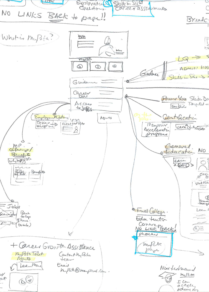 Sketch thinking on new ways to organize and present the program benefits.
Ideation led to sketches and wireframing for the page overview.
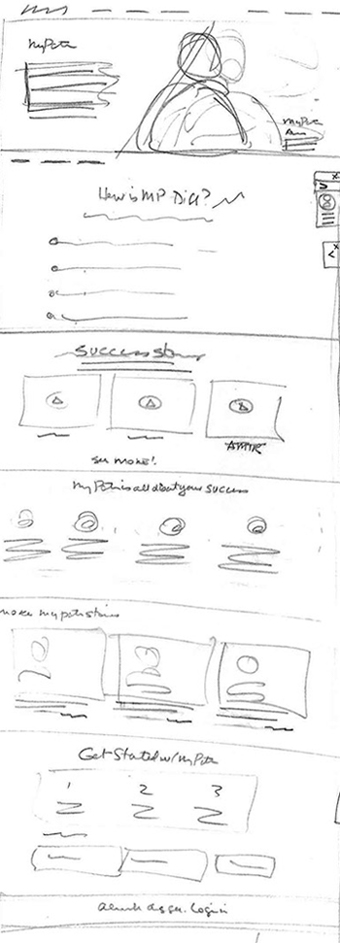
SKETCH
Hierarchy created with input from priority guides
Hero would include real MyPath associate
Accordion gives overview of complex information
Users delve deeper in manageable chunks
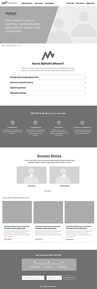
WIREFRAME
Wireframe with accordion UI in place
Testimonials create a story to relate to users
Testimonials create social validation
Users can imagine a new success story
See the Invision prototype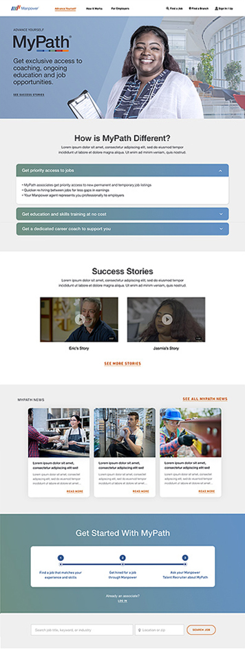
FINAL VISUAL DESIGN
MyPath articles reinforce possibilities
A three step process to get started with MyPath
Testing by the corporate Manpower team
The MyPath overview interactive wireframe was compared to the current MyPath website page using remote unmoderated testing through Validately.com with a goal to determine if the wireframe organization was more effective in communicating the MyPath concept and benefits to the user.
Sample of test questions
- How confident are you that you understand what MyPath is? (1 to 5)
- Who do you think this page is for? (think aloud)
- How likely are you to click/watch a video? (1 to 5) Why? (think aloud)
Results reported
- The wireframe gave participants more confidence that they understood the MyPath program when compared to the current MyPath site page.
- The wireframe showed participants to be more likely to watch a video and more satisfied with the wireframe overall than the current MyPath website page.
Manpower.com Retrospective
The client was very excited to be implementing the design system for the U.S. and global websites. They felt confident that the problems of the current site had been addressed and that the new websites would be highly effective in positioning Manpower as having a significant advantage against current job-board style sites. Once visitors understood the superior service that Manpower could offer, their applications and job placement numbers would improve. On-going testing and analytics will support and tweak this growth.
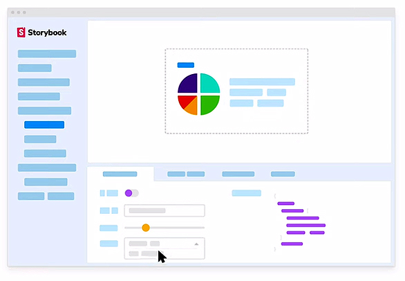
To implement development easily, the Rightpoint team provided a set of Globals, Components, and Templates using the Storybook design system cloud platform. All work included front-end code for implementation within a development system. The Storybook documentation also included alerts for any Accessibility violations. The deliverables contained no violations.
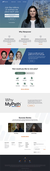
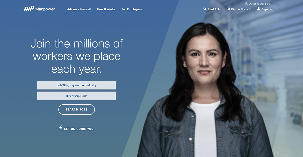
The homepage final design
Room for growth
The project spanned 10 weeks and moved quickly. Personal growth was rapid while working with the team. I learned to work within the parameters of the UX role, embracing the excitement of using research and human factors knowledge to support my recommendations to the team.
Specific areas of the project such as MyPath where my contributions helped to solve a complex issue were highly rewarding.
Manpower.com project highlights
- Working in a large team with roles for UX director, account and product managers, visual designers, UX designer and content strategist was new and exciting.
- A strong understanding of UI pattern best practices and human factor psychology was used to promote and support UX design decisions.
- Learning a process where team worked in a series of sprints with UX sketching and wireframing 1 sprint ahead.
- Learning how Storybook cloud software is used to organize and deliver Global elements (buttons, color palette etc), Components (accordions, widgets) and Templates (pages, application flow, search) in a disciplined and scalable way.